Overview
Goal: Build a book inventory app that helps readers easily organize and discover books.
Challenge: Existing platforms were cluttered and unintuitive, with limited options for shelving and note-taking.

Problem Statement
Primary challenge: Design a mobile-first app that readers actually enjoy using. It needed to go beyond simple tracking and give users flexible shelving, clear reviews, and a smooth purchase journey.
KPIs:
• % of new users who create a shelf and add a book
• Ongoing engagement through reviews and notes
• Completion of purchase journeys (browse → book detail → add to shelf/cart → checkout → confirm)

Research & Insights
I conducted both secondary and primary research:
Secondary Research: Print books remain the preferred format for most readers. Book lovers often own large personal collections and want digital tools to organize them.
Competitive Analysis: Goodreads and similar apps were cluttered and hard to navigate. Few apps offered clean shelving options or personal note-taking.
Persona: Created “Kimberly,” a 31-year-old avid reader who loves collecting books and sharing opinions with friends.
User Interviews - Readers Wanted:
• Flexible shelving and categorization
• A space to write personal notes and highlights
• Reliable reviews to guide purchases


Define
From research, I prioritized:
Core Features: Shelving, reviews, notes, and purchase flow
Information Architecture: Simple flows for adding books, browsing shelves, and purchasing
Feature Roadmap: P1 = discover, recommendations, wishlists, shelving, reviews, notes purchase flow, P2 = audio features, P3 = social features, premium features


Ideation & Design
Sketches: Iterated on shelf creation, book detail, and checkout
Wireframes: Refined mid-fi flows for browsing, shelving, and annotations
Branding and UI Kit: Muted blue color palette, clean typography, logo inspired by classic literature such as Moby Dick


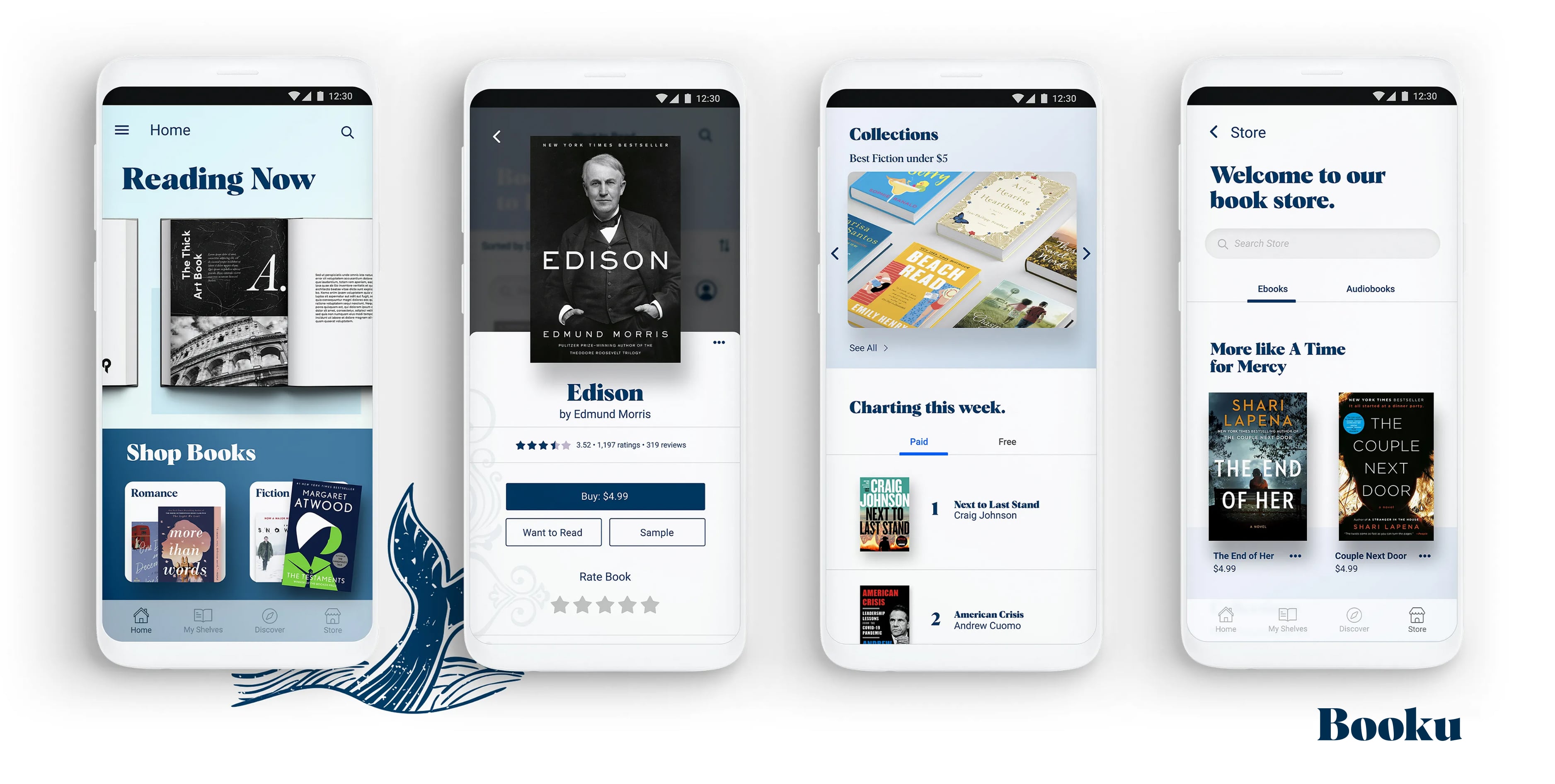
Prototype
After developing a UI kit, it was time to create high-fidelity prototypes. Below are the various screens I created for doing multiple tasks on the app.
High-fidelity prototypes covered the main journeys:
Key features:
• Creating a shelf and adding books
• Writing and reading reviews
• Smooth purchase flow for new books
-min.jpg)

-min.jpg)
-min.jpg)
-min.jpg)
Testing
I conducted usability tests on Maze with 3 target users completing 2 key tasks: Add a book to a shelf, and Write a note while reading.
Results:
• 100% task success rate
• Shelving and reviews were intuitive
• Some confusion with publishing notes, which led to UI refinements

-min.jpg)
Reflection & Next Steps
What worked: A clean structure, strong shelving system, intuitive reviews, and smooth purchase journey
What I’d do differently: Test with more users to validate annotation features earlier
Next Steps: Add personalization, explore lightweight social features, refine purchase integrations
Key Objectives, Research Insights, and User Pain Points
The core business goal was to increase overnight bookings in Pierce County. Supporting objectives included improving mobile usability, surfacing high-value content like events and seasonal itineraries, and giving the DMO team more flexibility in how they told Tacoma’s story.
Research included analytics, stakeholder interviews, and competitive audits. Key pain points included:
- Content was difficult to find and poorly organized
- Navigation was overwhelming, especially on mobile
- Events and planning tools were underutilized and not promoted clearly
- Users lacked a quick, intuitive way to understand what Tacoma had to offer

Visit Blacksmith Branding