Overview
Goal: Help “Mirror,” a global brick-and-mortar clothing retailer, launch their first e-commerce presence and refresh their outdated brand.
Challenge: Customers struggled with limited in-store inventory and no online option. Mirror also needed a modern, neutral brand identity to reach a broad audience.
Problem Statement
Primary challenge: Design a responsive e-commerce website that is easy to browse, filter, and purchase from.
Branding challenge: Refresh Mirror’s logo and style system to appeal to a broad customer base.
KPIs:
• Completion of purchase journeys (browse → product detail → cart → checkout → confirmation)
• High task success rate for product discovery (users can quickly find items using filters and search)
• User confidence in online shopping (measured by clarity of sizing info, product details, and reviews)
Research & Insights
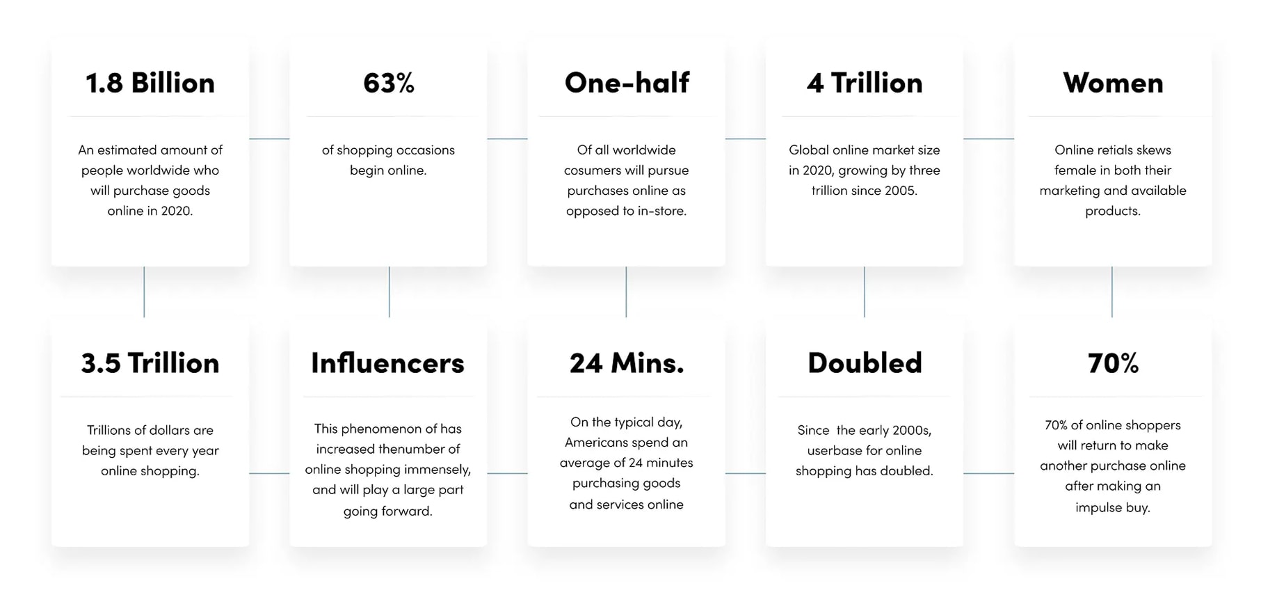
I conducted both secondary and primary research:
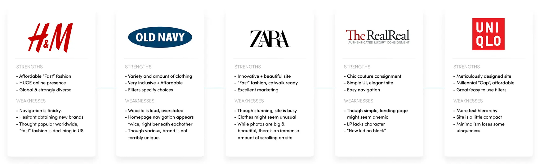
Competitive Analysis: Evaluated online retailers for layout, hierarchy, and visual clarity. Common issues included: cluttered pages, poor typography, inconsistent navigation, and overwhelming scrolling.
User Interviews: Learned that frustrations stemmed from unclear sizing, difficulty finding products, and lack of trust in online quality.
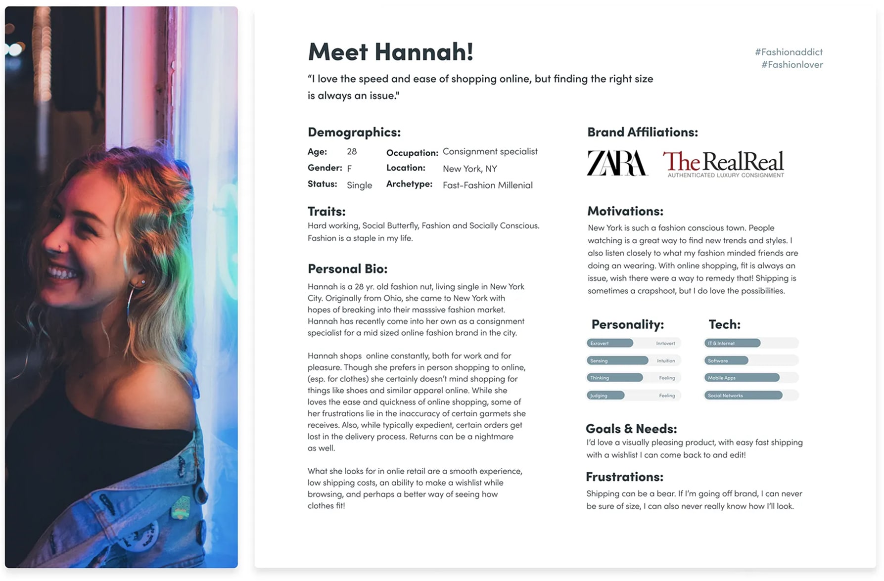
Persona: Created “Hannah,” a busy professional who prefers in-store shopping but wants convenience and reliable sizing online.
Key Insights:
• Users want simplicity and trust.
• Clear product info, filters, and a frictionless checkout are critical.
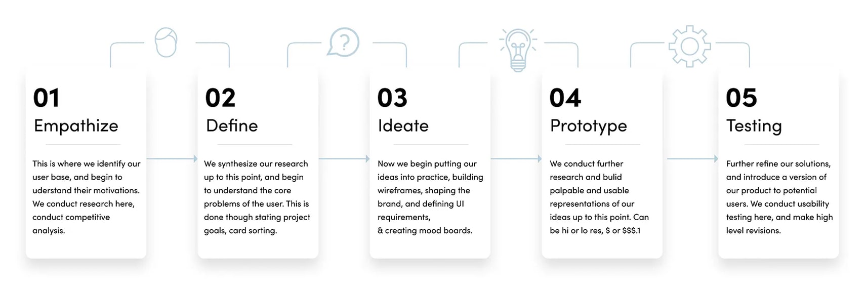
Define
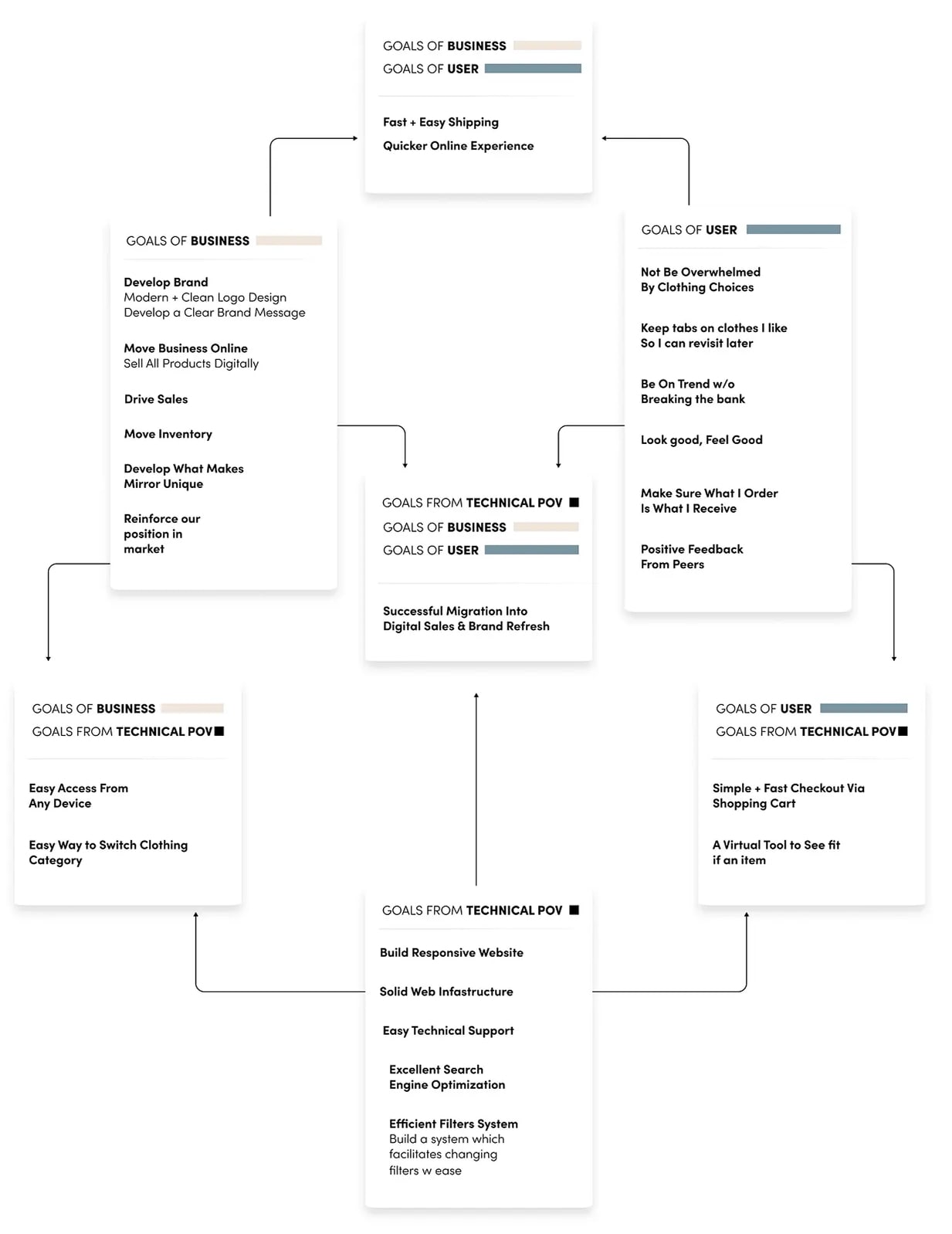
Based on research, I synthesized findings into:
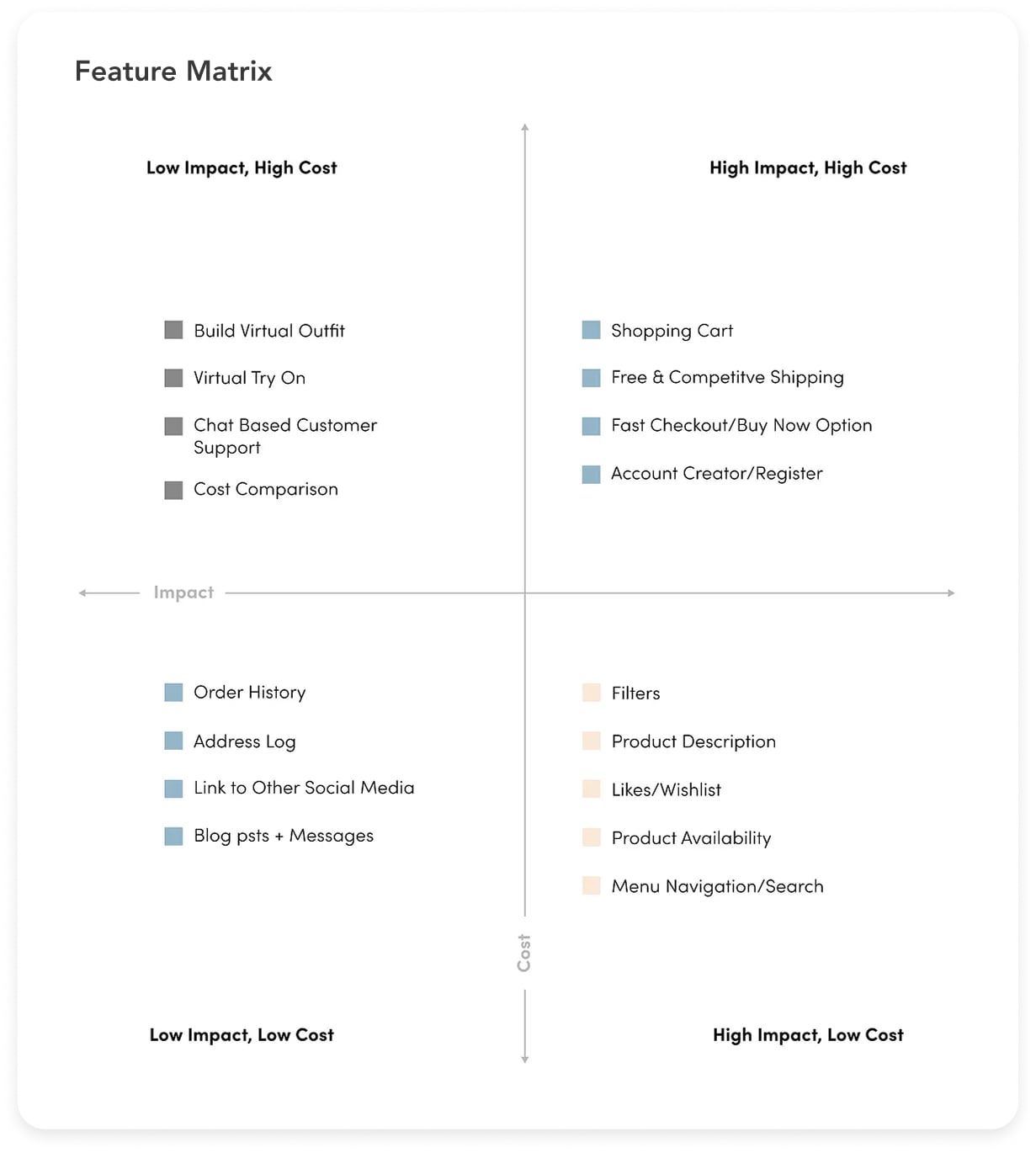
Feature Roadmap & Matrix: Prioritized core functionality (filters, reviews, simplified checkout) versus nice-to-haves. Each feature labeled P1/P2/P3 for importance and estimated effort.
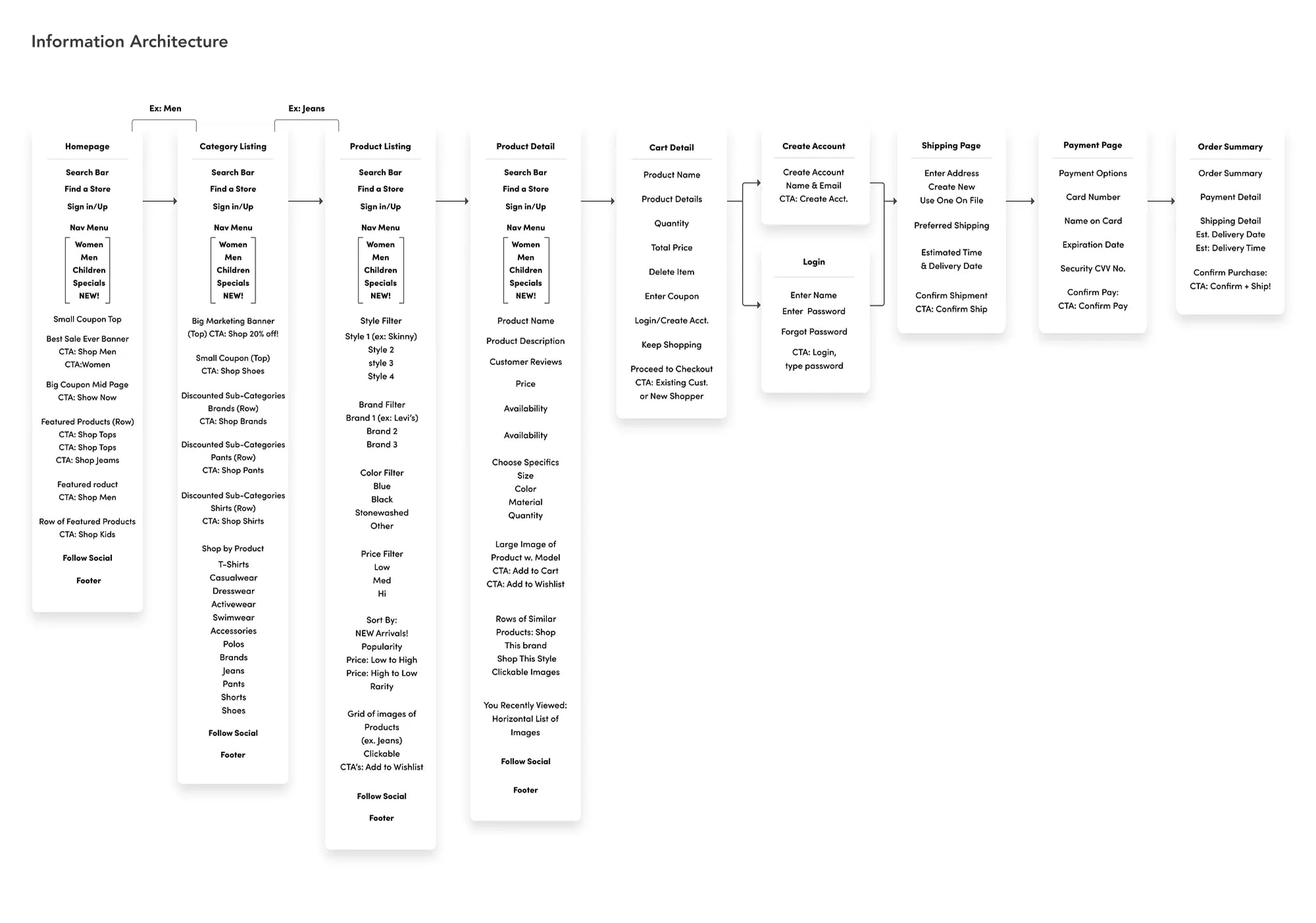
Information Architecture: Developed a sitemap highlighting logical page hierarchy and clear CTAs.
Ideation & Design
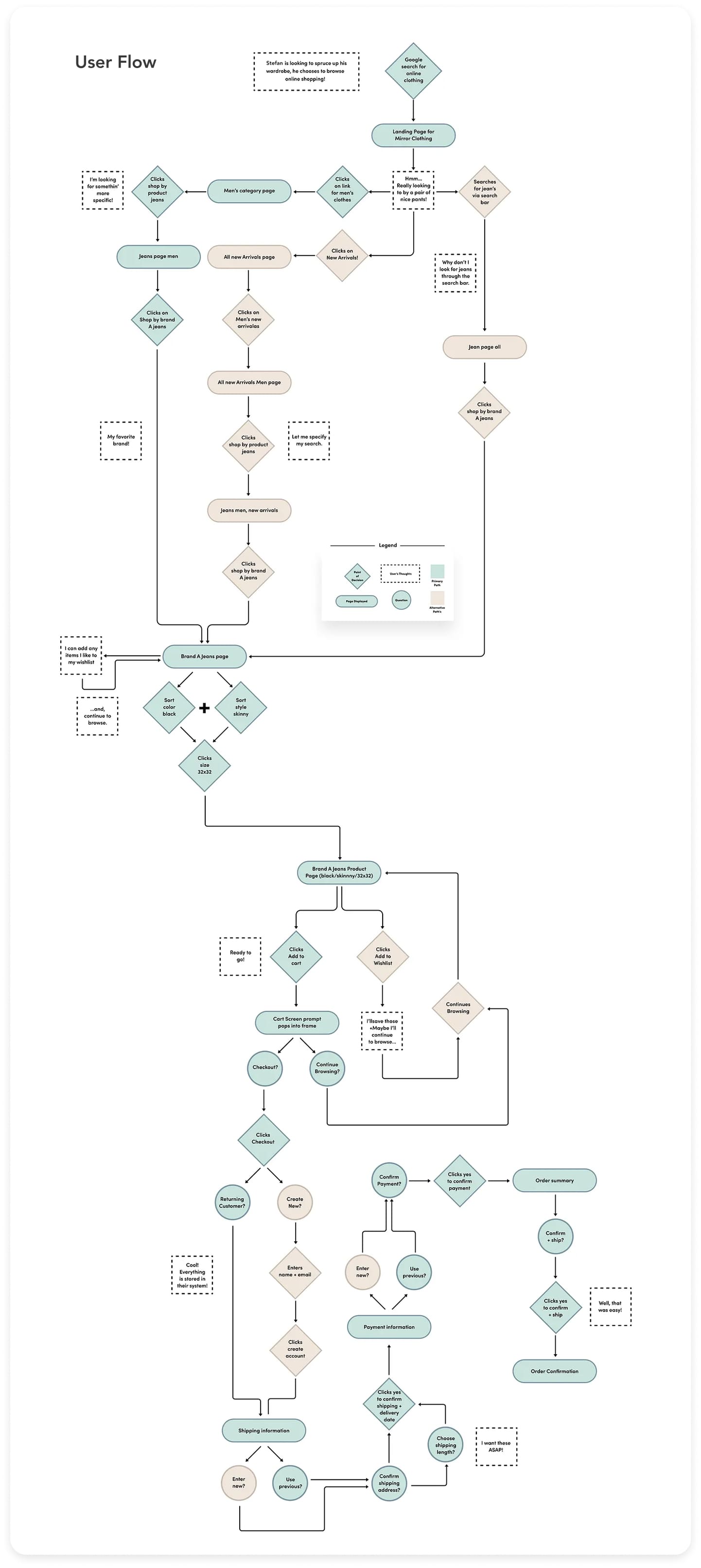
User Flows: Mapped key purchase journeys, e.g., buying men’s jeans or women’s dresses, considering all possible paths.
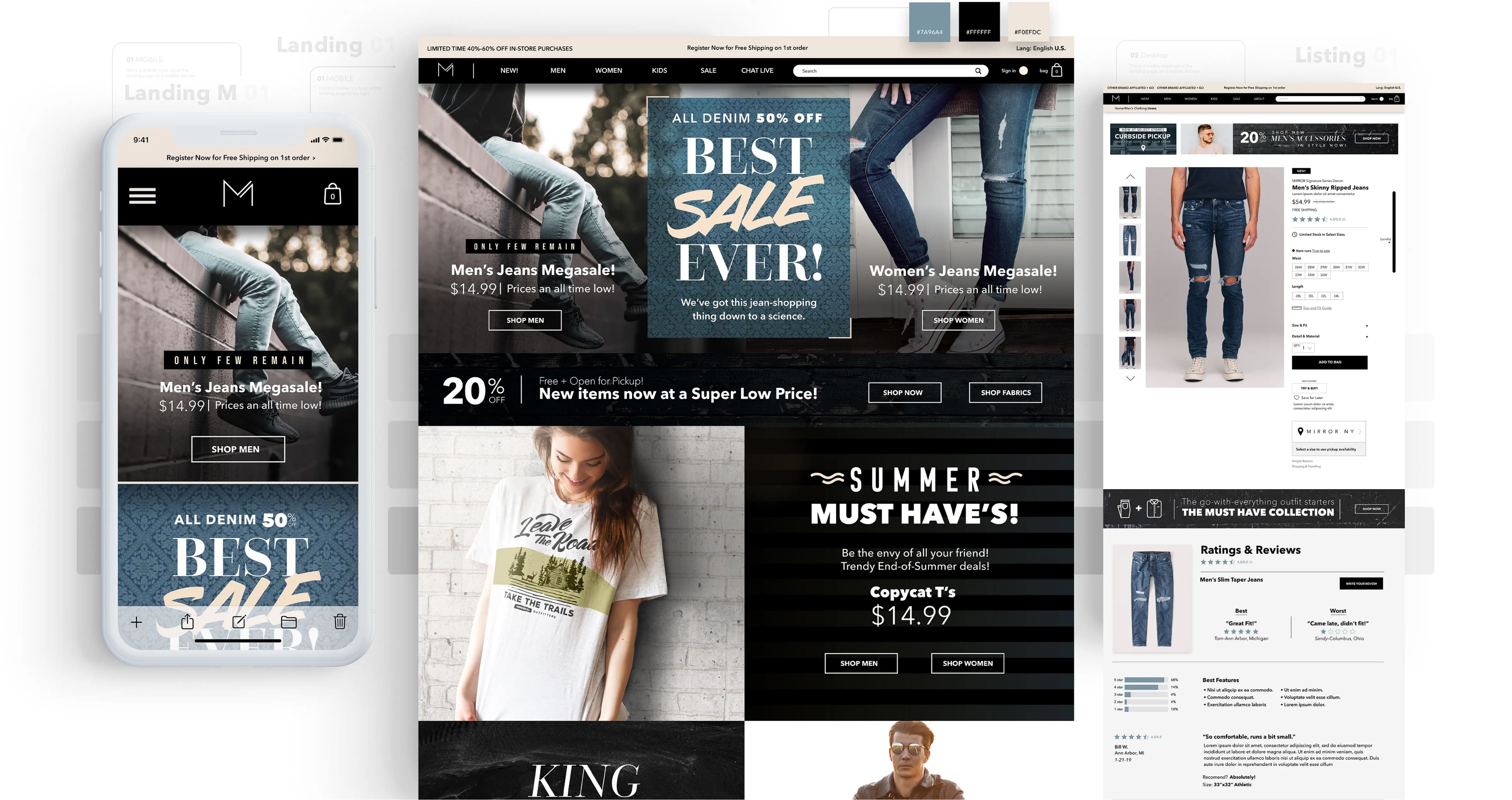
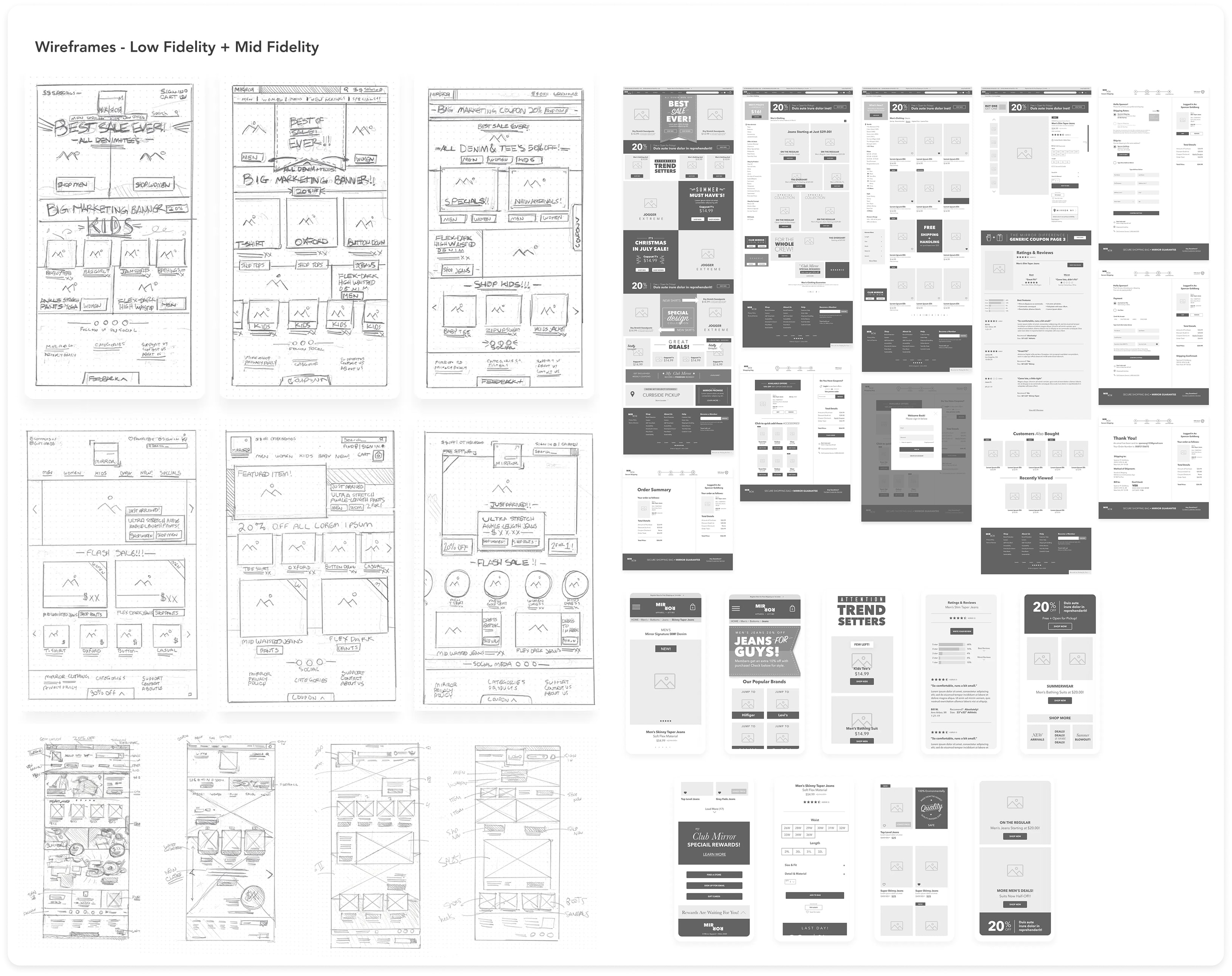
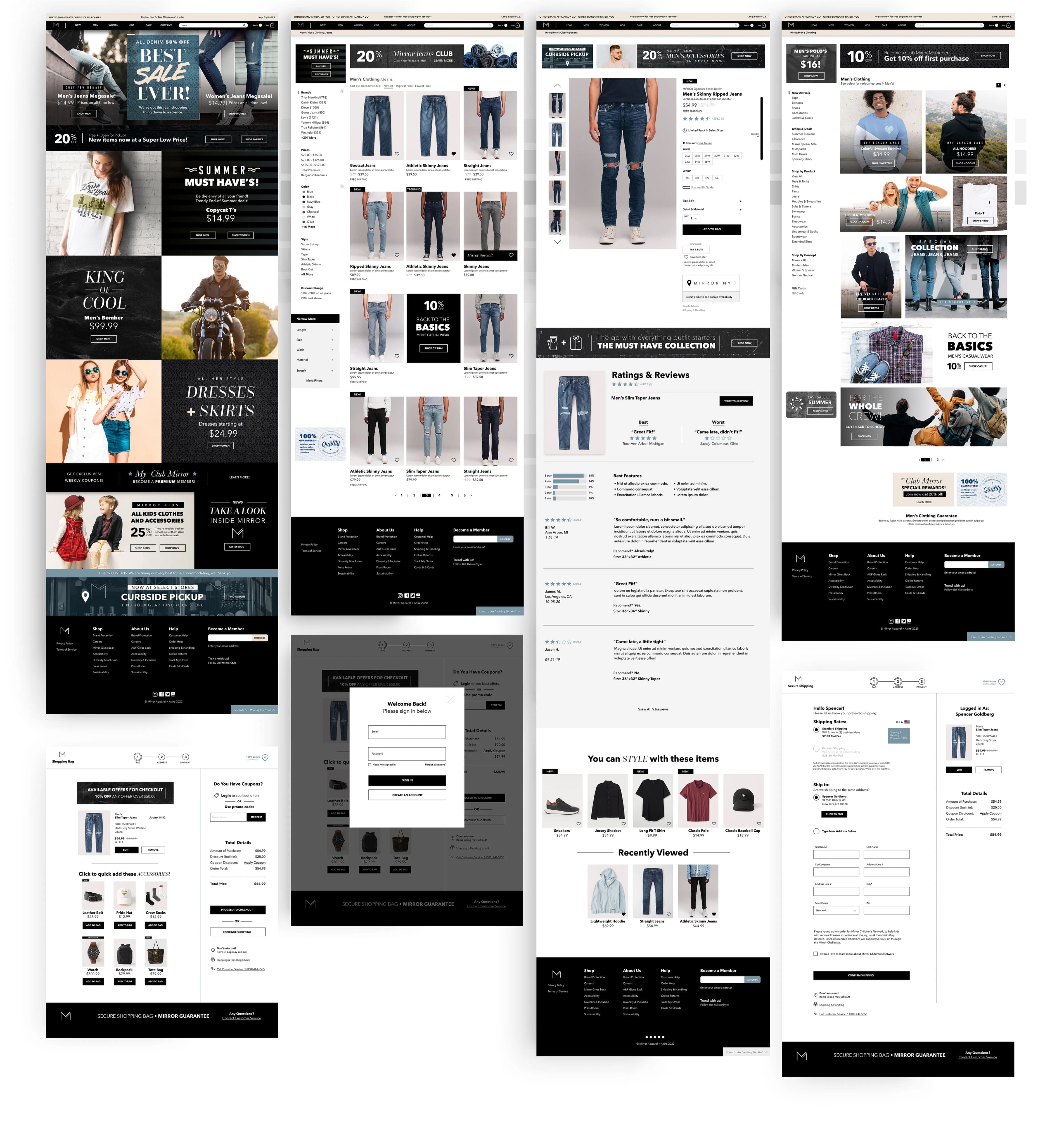
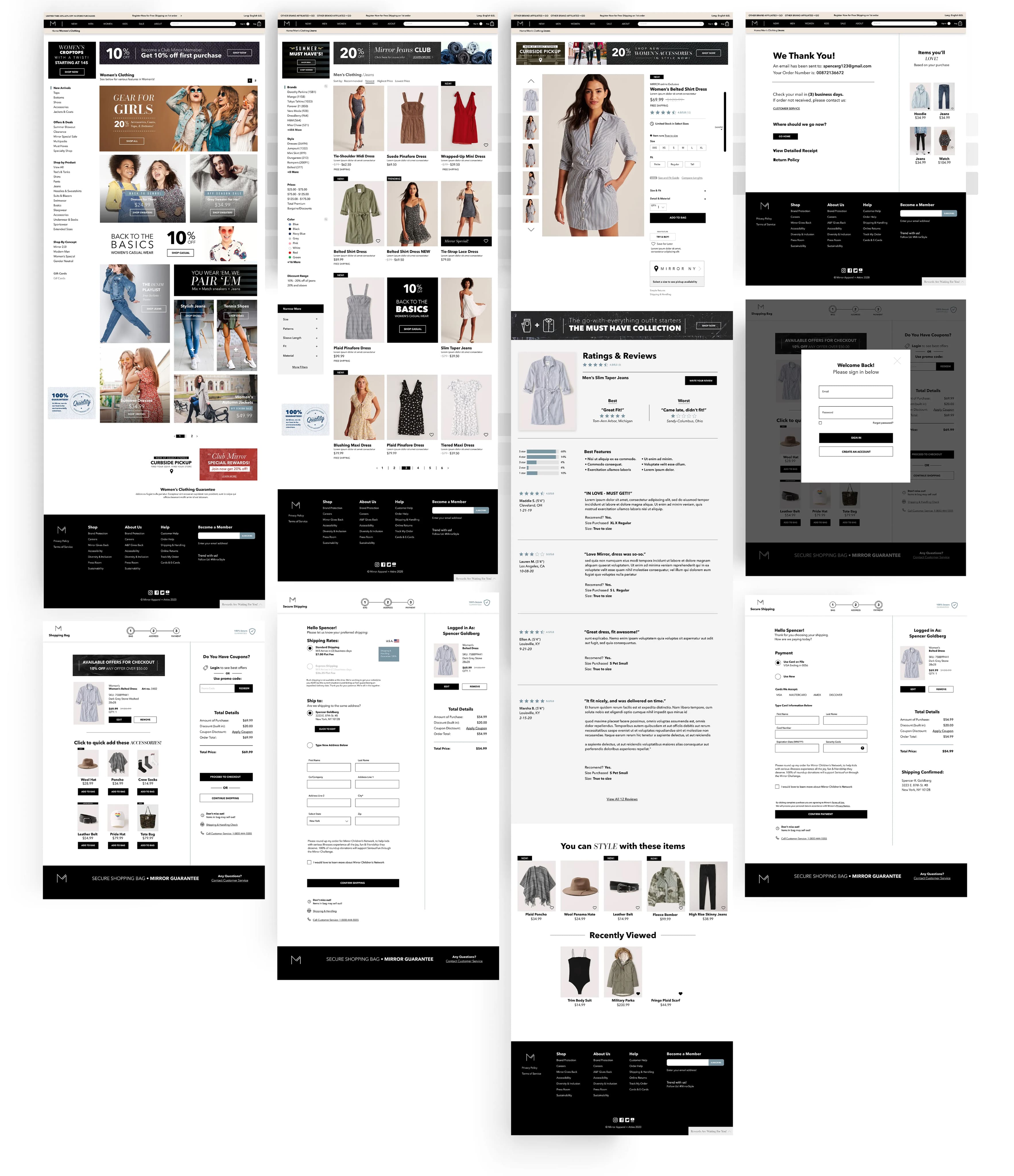
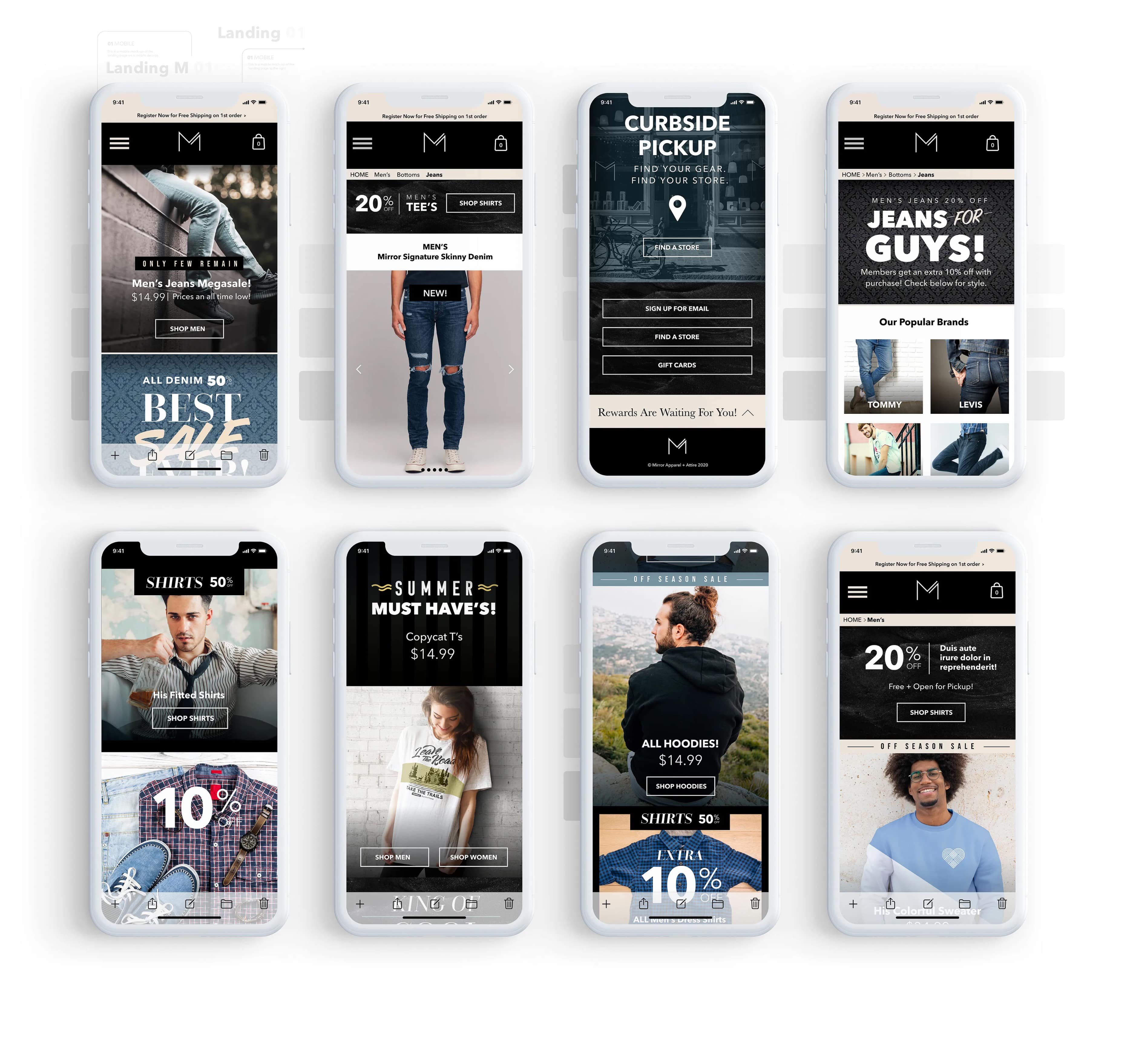
Wireframes (desktop & mobile): Iterated layouts focusing on reducing friction from browsing → cart → checkout.
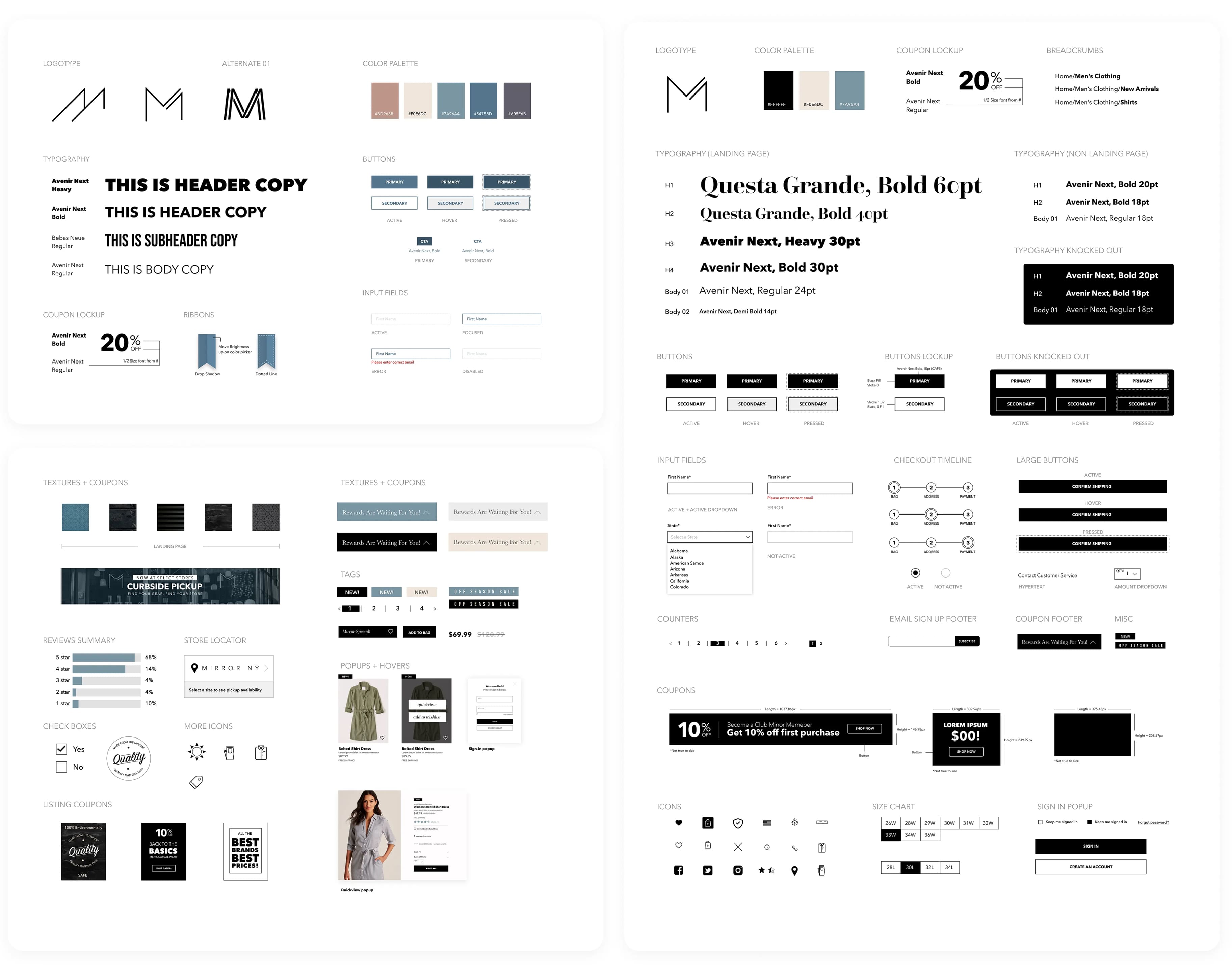
Branding: Created a modern, minimalist logo inspired by Avenir Next Ultra Light.
UI Kit: Black-driven palette, modern typography, reusable components (buttons, forms, pop-ups).
Prototype
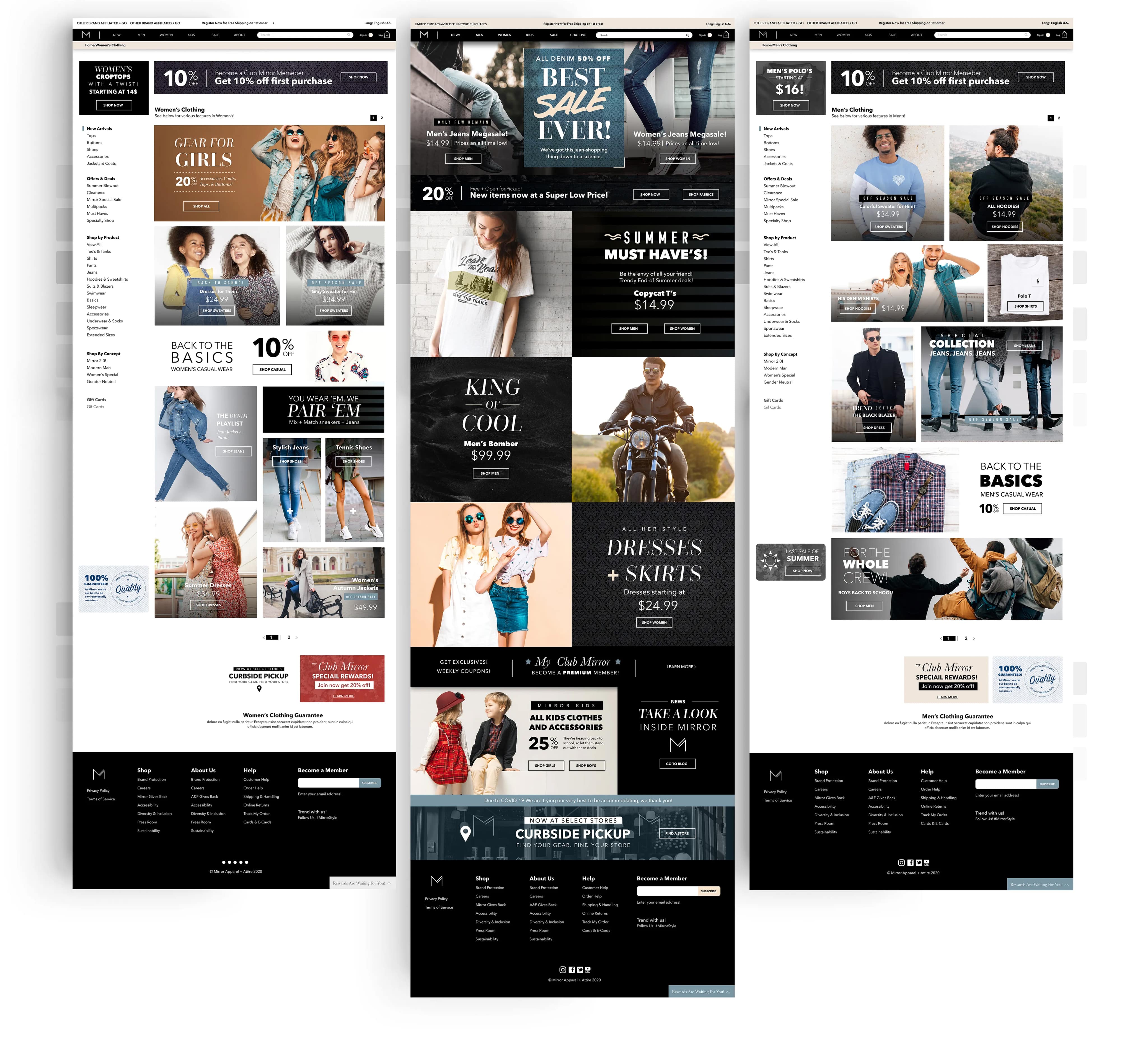
Developed responsive high-fidelity prototypes for desktop and mobile for homepage, mens / womens, listings, product details + reviews, and purchase journey.
Key features:
• Category and product pages
• Streamlined cart and checkout flow
• Trust-building elements (reviews, pricing clarity, size filters)
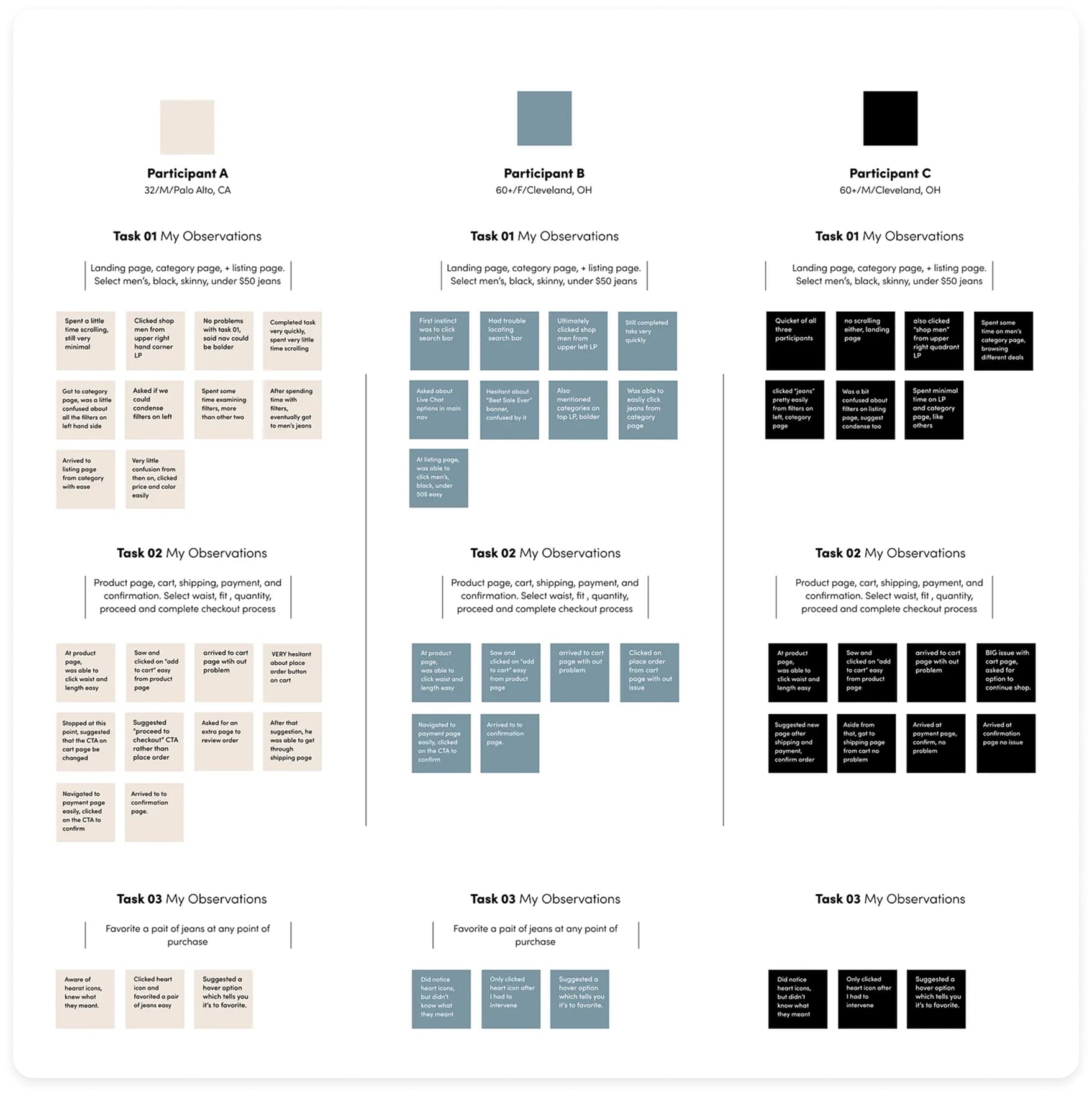
Testing
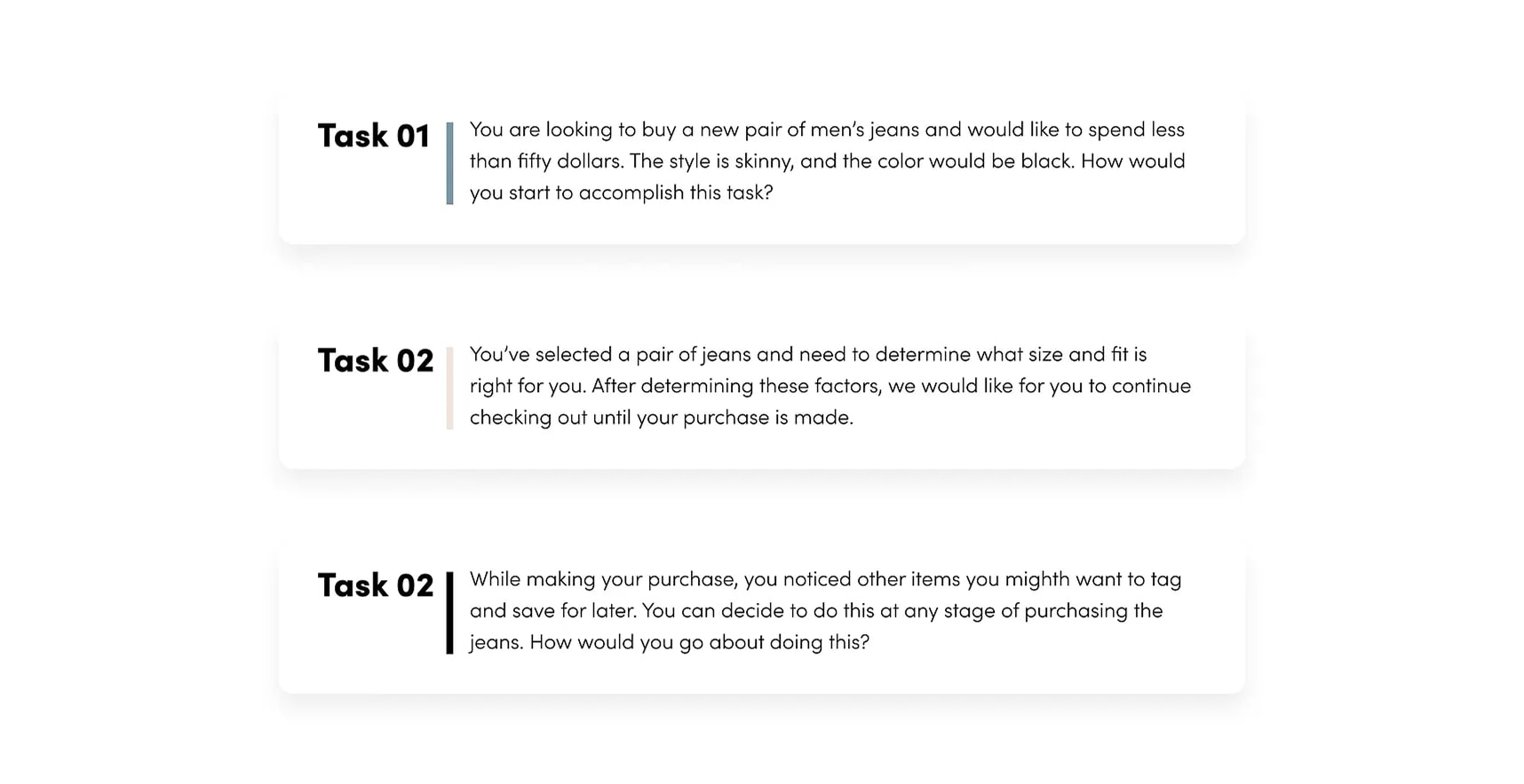
I conducted 3 usability tests with target users completing key tasks: browsing, selecting jeans, and checking out.
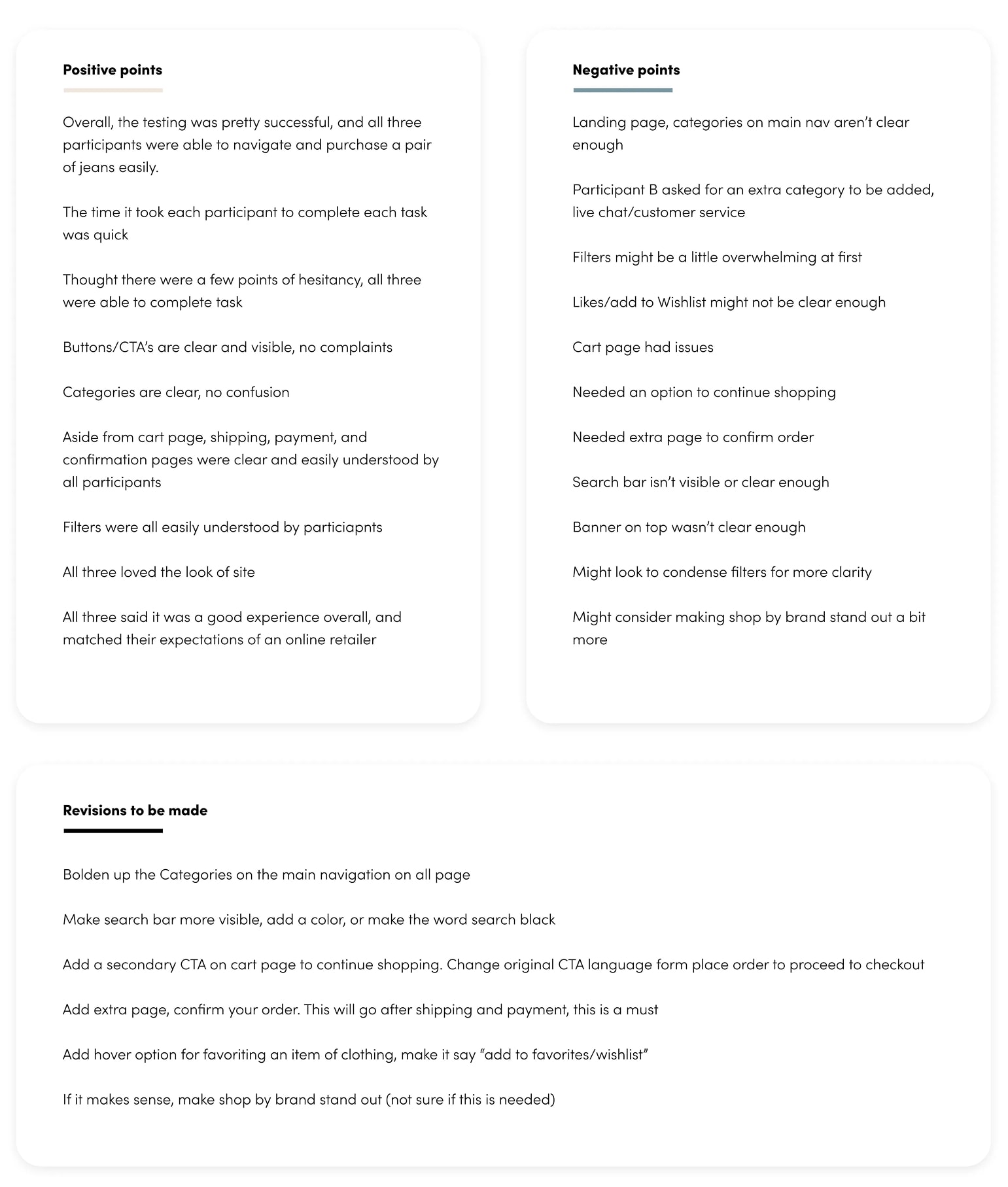
Positive Takeaways:
• All participants completed tasks successfully.
• Navigation, categories, filters, and CTAs were clear.
• Overall experience and visual design were well-received.
Areas for improvement:
• Make search bar and categories more prominent.
• Clarify “Like/Add to Wishlist” and checkout confirmation.
• Add “Continue Shopping” CTA and optional order confirmation page.
Next Iterations: Adjust page hierarchy, enhance search visibility, refine checkout flow, and improve wishlist interaction.
Reflection & Next Steps
What worked: Strong research foundation, cohesive brand, responsive prototypes, clear purchase journeys.
What I’d do differently: Broader testing with more participants; expand purchase flows for additional product types.
Next Steps: Provider dashboard, deeper personalization, A/B testing of UI variants.
Key Objectives, Research Insights, and User Pain Points
The core business goal was to increase overnight bookings in Pierce County. Supporting objectives included improving mobile usability, surfacing high-value content like events and seasonal itineraries, and giving the DMO team more flexibility in how they told Tacoma’s story.
Research included analytics, stakeholder interviews, and competitive audits. Key pain points included:
- Content was difficult to find and poorly organized
- Navigation was overwhelming, especially on mobile
- Events and planning tools were underutilized and not promoted clearly
- Users lacked a quick, intuitive way to understand what Tacoma had to offer

Visit Blacksmith Branding