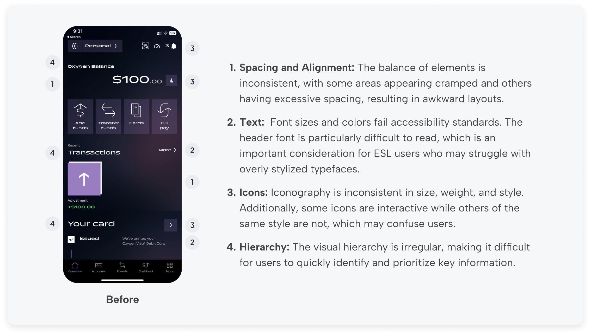
Original Design Analysis
My audit of the original home screen revealed several critical issues. The design had poor contrast that failed accessibility checks, and its information hierarchy was unintuitive, making it difficult for users to quickly find key information. The font choices were also problematic, as they were not legible at smaller sizes. I also noted a missed opportunity to include a clear call-to-action to promote product upgrades.
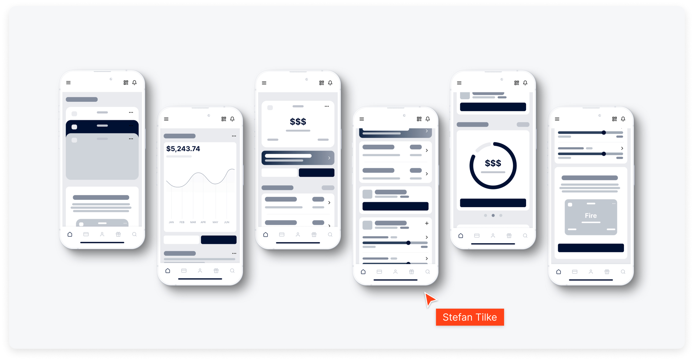
Wireframes
I began by creating wireframes to explore different layouts. This simple, block-based method allowed me to quickly re-order and combine sections. It helped me make high-level decisions about content hierarchy and the overall user flow before committing to a visual style.
Key Objectives, Research Insights, and User Pain Points
The core business goal was to increase overnight bookings in Pierce County. Supporting objectives included improving mobile usability, surfacing high-value content like events and seasonal itineraries, and giving the DMO team more flexibility in how they told Tacoma’s story.
Research included analytics, stakeholder interviews, and competitive audits. Key pain points included:
- Content was difficult to find and poorly organized
- Navigation was overwhelming, especially on mobile
- Events and planning tools were underutilized and not promoted clearly
- Users lacked a quick, intuitive way to understand what Tacoma had to offer
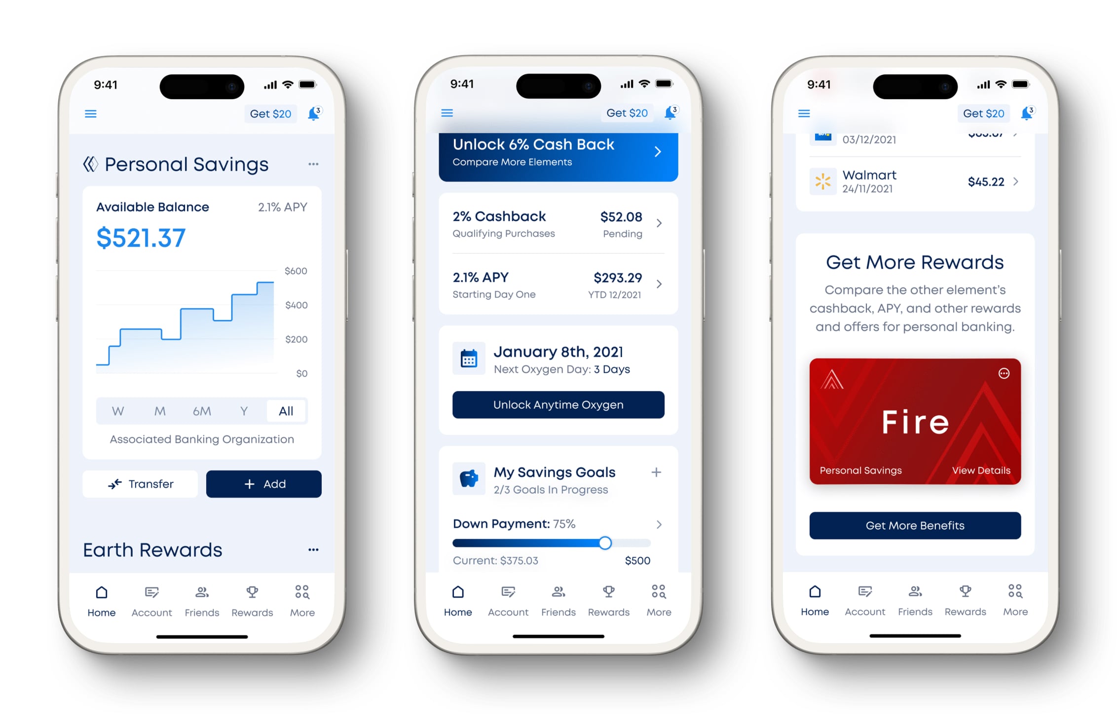
V1 High Fidelity
For the first high-fidelity version, I tested a new color palette using shades of blue and light gray. This version established a clear visual hierarchy and ensured all text was legible while meeting WCAG accessibility standards.
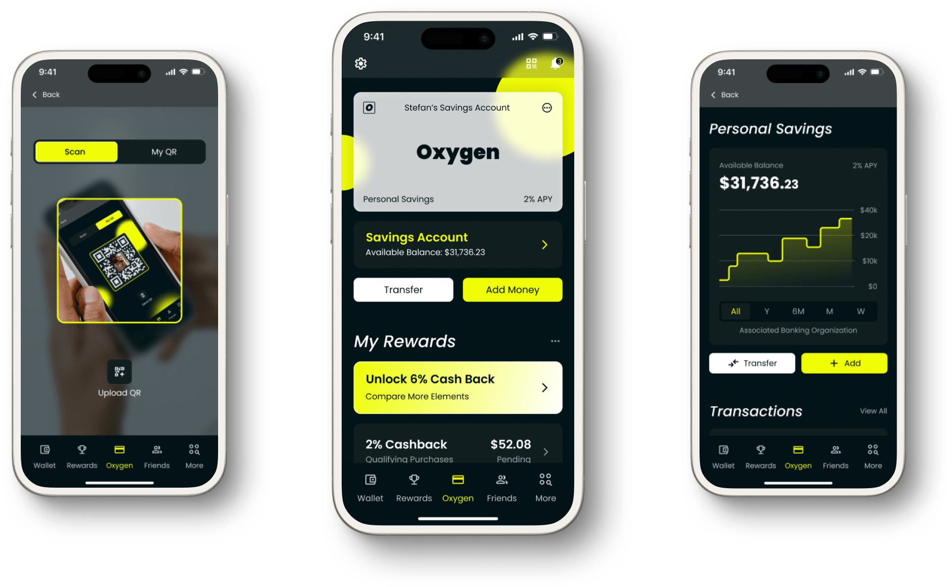
Final Design
The final version uses both a light and a dark theme. When compared to the original design this final version has improved contrast, hierarchy, font choice, and accessibility throughout the design. Each section has an updated layout from the original and is consistent throughout the design.
Icons: Consistent size, weight, and style, and there are fewer icons in the navigation
Text: Text is legible, adheres to standard sizing, and establishes an effective hierarchy
Colors: Light and Dark Mode
-min%20(1).jpg)

Conclusion
This project allowed me to apply a full UX process in a self-directed context, from research and analysis to high-fidelity design. By addressing usability, accessibility, and hierarchy issues, I was able to create a polished and user-friendly home screen. The project demonstrates my ability to identify problems, propose thoughtful solutions, and execute a coherent design, even without a formal client brief.

Visit Blacksmith Branding