White Label
A single, powerful platform, custom-styled to seamlessly integrate into any brand's digital ecosystem.
Key Objectives & Strategic Insights
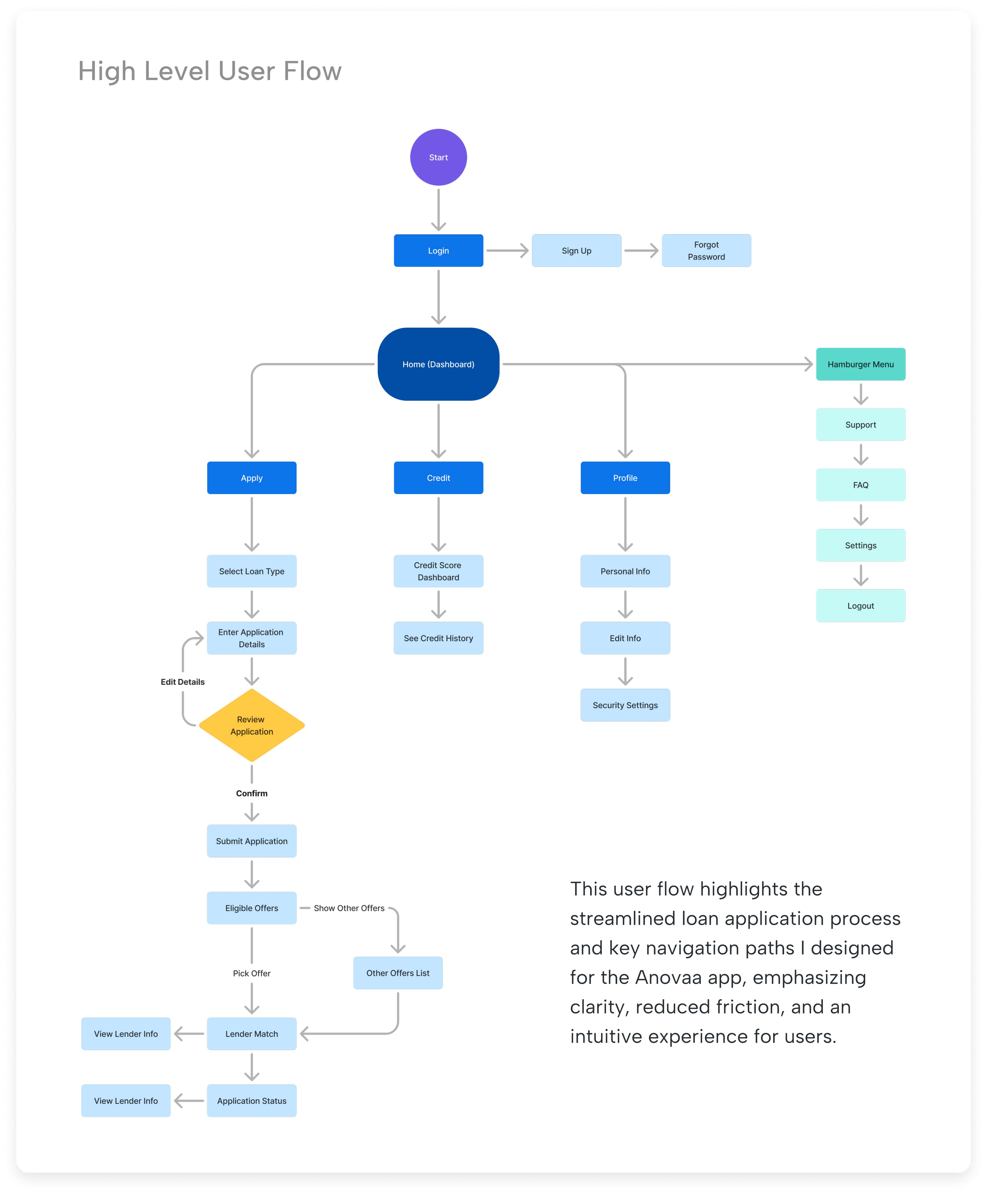
The primary objective was to optimize the core user flow to drive higher loan application completion rates. Key strategic goals included:
• Improving the clarity and usability of the application process.
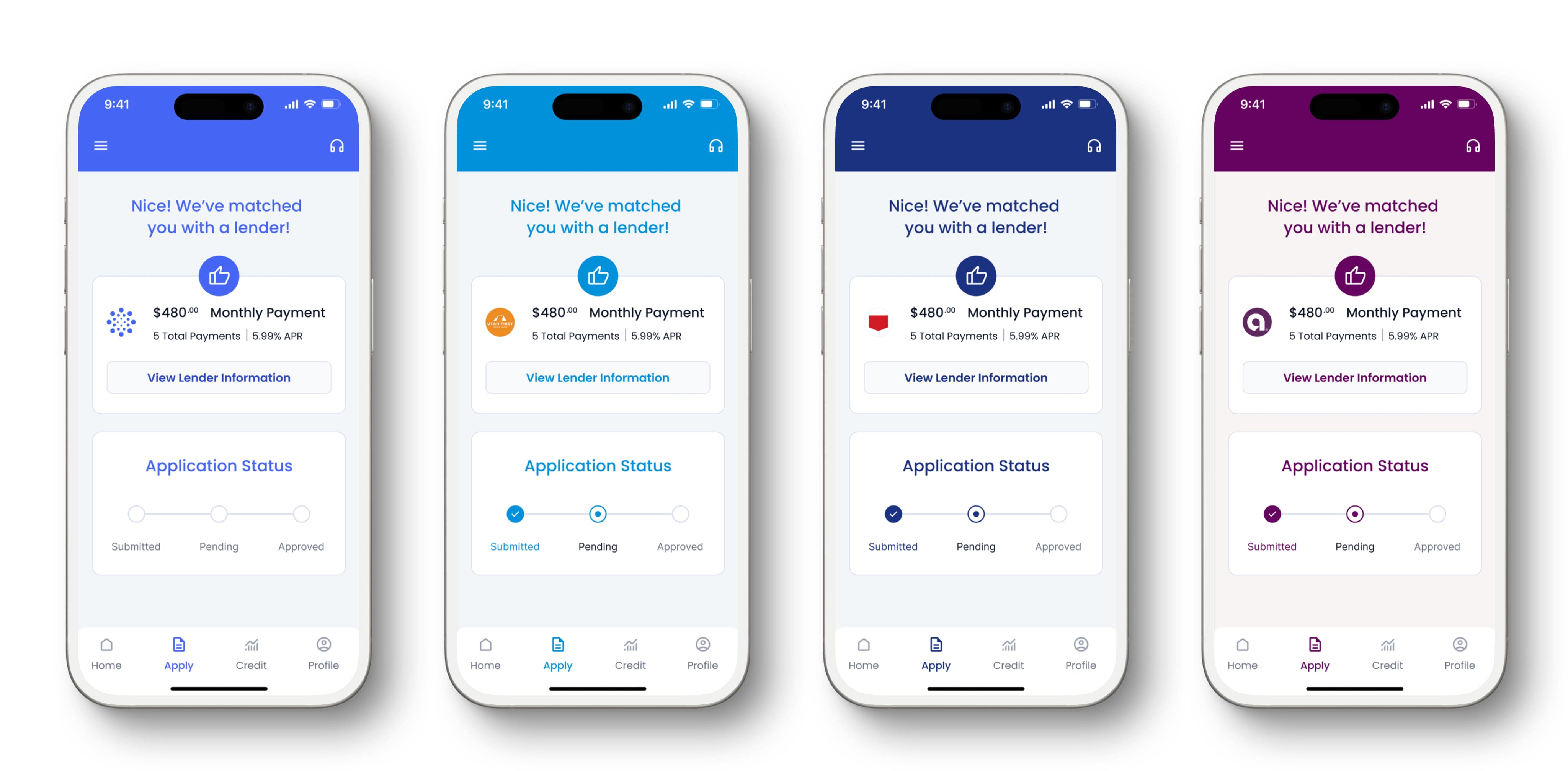
• Ensuring a clear and logical path for users to track their application status.
• Designing a public-facing website that articulated the company's value to business clients.
• Creating a clean, trustworthy aesthetic that could be applied to both the app and the website.
Collaboration & Constraints
I partnered closely with Anovaa’s product manager and engineering team to align design improvements with business requirements and technical limitations. Key constraints included backend architecture and compliance rules, which guided how we refined the loan application flow while still delivering a cleaner, more intuitive experience.
Design Approach
TL;DR: Led the redesign of a fintech app's UX and visual identity, streamlining its core loan application flow and creating a new marketing site to better articulate its value, all supported by a component-based design system in Figma.
──────────
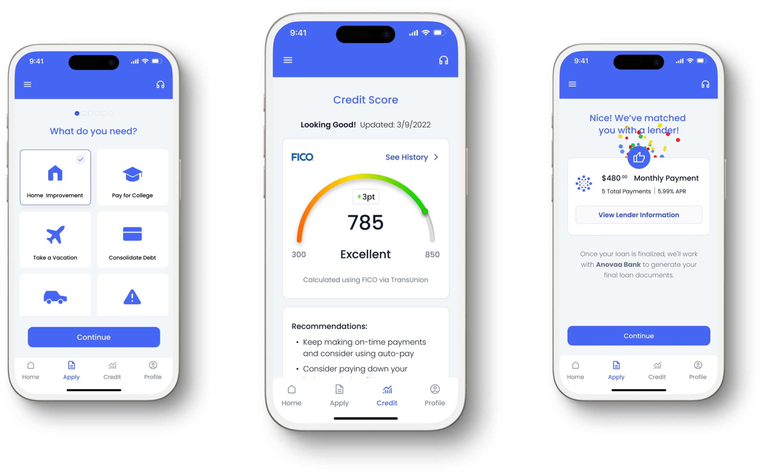
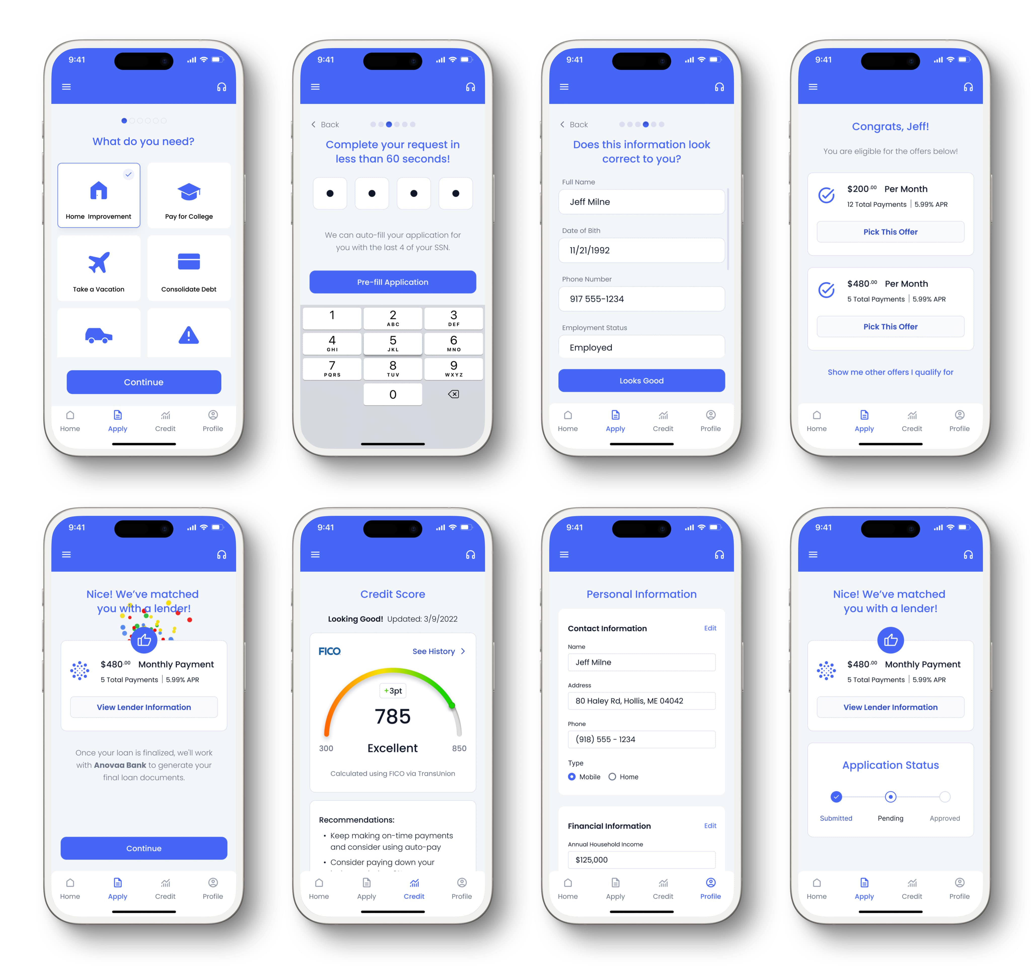
My approach was to create a focused, user-centric design system that simplified complex financial concepts. The app’s architecture was designed around a clean, four-button navigation to make core tasks intuitive. My work included a full analysis and redesign of the loan application flow to reduce friction and improve completion rates.
The visual design prioritized clarity and trust. I used a calm, professional color palette centered around blues and grays, with a clear typographic hierarchy to ensure all financial information was easy to read and understand. I redesigned key screens like the credit score dashboard and application status tracker, creating a streamlined, modern feel that built user confidence.
On the web side, I designed a public-facing marketing site to serve as the new "front door" for the business. I created an information architecture, scalable design system, and a series of layouts that could clearly communicate Anovaa's value propositions to potential enterprise clients while showcasing their impressive track record of over $5 billion in annual loans.
Homepage
Key Objectives, Research Insights, and User Pain Points
The core business goal was to increase overnight bookings in Pierce County. Supporting objectives included improving mobile usability, surfacing high-value content like events and seasonal itineraries, and giving the DMO team more flexibility in how they told Tacoma’s story.
Research included analytics, stakeholder interviews, and competitive audits. Key pain points included:
- Content was difficult to find and poorly organized
- Navigation was overwhelming, especially on mobile
- Events and planning tools were underutilized and not promoted clearly
- Users lacked a quick, intuitive way to understand what Tacoma had to offer
Outcome
The updated product and marketing site both successfully launched, giving the company a cohesive and professional digital presence that aligned with their impressive market position. The new design provided a clear, intuitive path for users to apply for and manage loans, supporting a best-in-class product experience. The updated website became a core asset for attracting new business clients and communicating the company's value at a glance. The company does over 5 Billion yearly in consumer loans with 8 million users.

Visit Blacksmith Branding