Key Objectives, Strategic Considerations, and Constraints
TL;DR: Redesign the site to reflect the firm’s growth and maturity while preserving its founder-first voice. Focus on clear messaging, audience trust, and flexible architecture to support future scaling.
──────────
The firm had grown significantly since I originally designed their first site and visual identity, and the new digital presence needed to reflect that maturity. The redesigned site had to communicate their mission clearly and credibly to high-level audiences while staying true to their unconventional, founder-first brand philosophy.
Core goals included:
• Reaffirming the firm’s credibility in defense, dual-use tech, and healthcare innovation
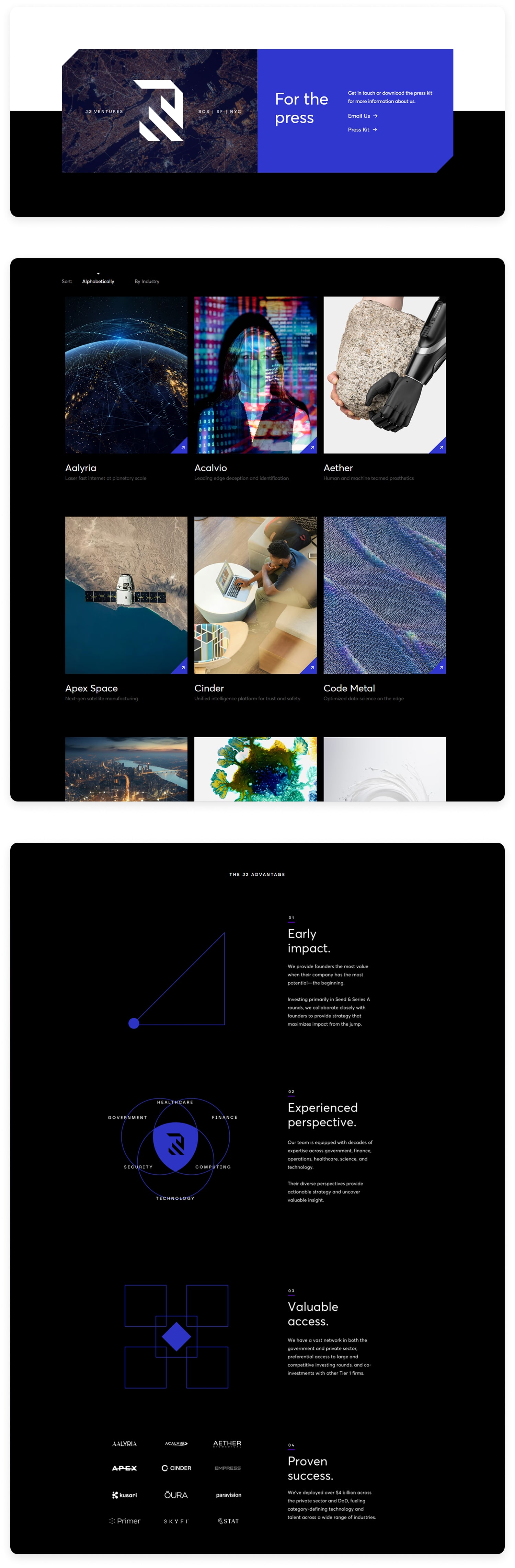
• Showcasing portfolio companies and leadership in a way that felt confident but not boastful
• Striking the right tone for founders, public-sector partners, and enterprise stakeholders
• Building a modern, performance-focused site that loaded fast and scaled easily
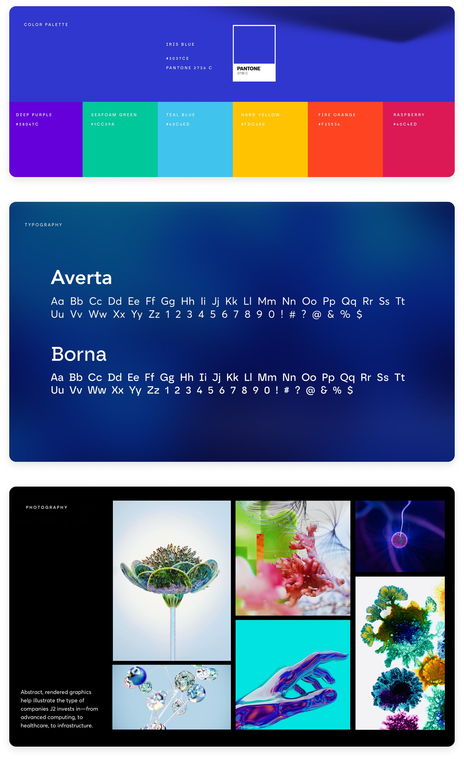
Strategic considerations included honoring an existing brand color and tone while introducing new visual structure and rhythm to better support messaging hierarchy. I also worked within time and content constraints to ensure the site could evolve with minimal development overhead as the firm continues to grow.
Design Approach
TL;DR: I grounded the redesign in a rapid, insight-driven approach that combined stakeholder interviews, light competitive review, and mobile usage data to shape a hierarchy and interaction flow that intuitively connects users to the firm’s mission and portfolio.
──────────
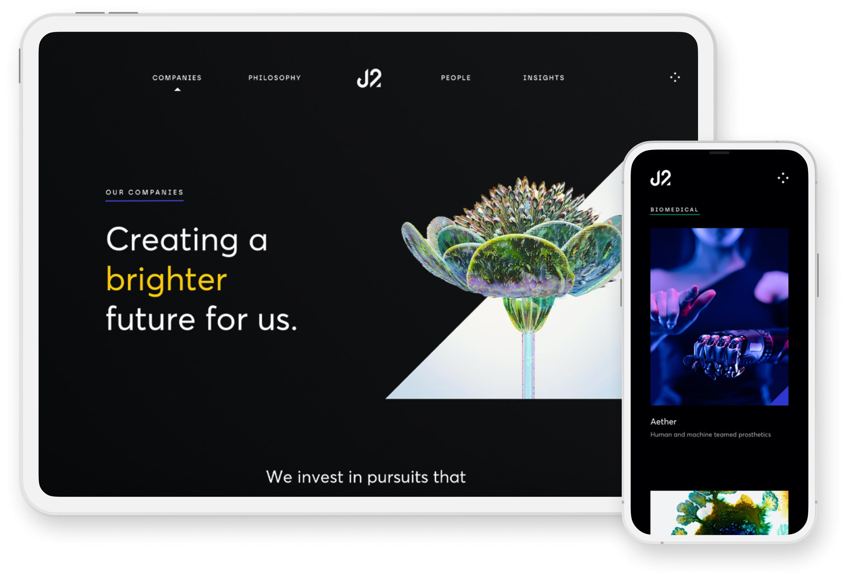
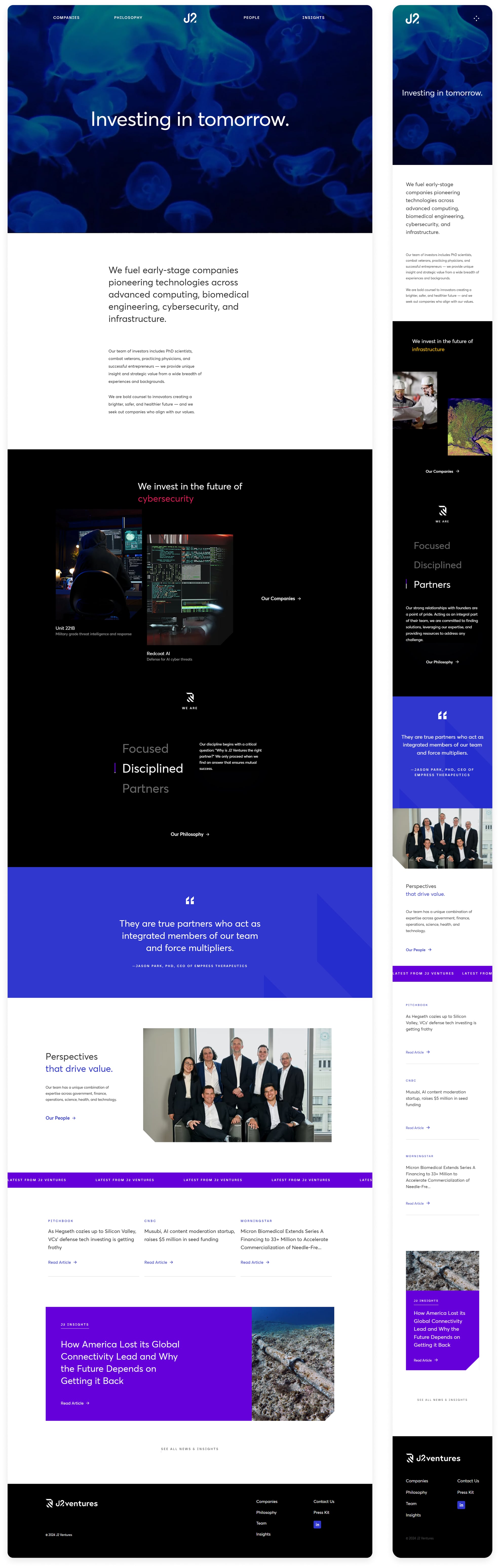
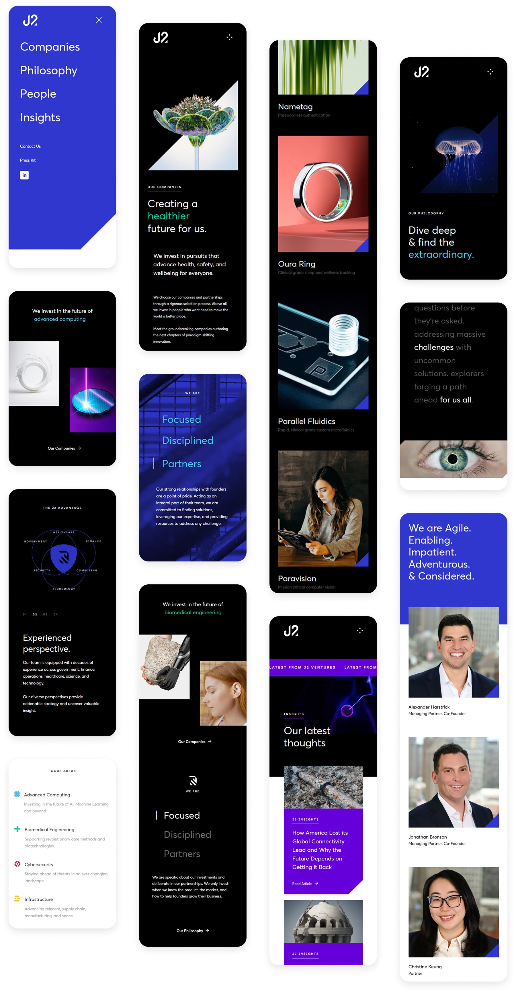
I used a restrained visual system built around dark backgrounds, sharp type, and selective color accents to guide focus and signal clarity. The firm’s signature blue served as a subtle throughline, reinforced by generous spacing, confident grid structure, and smart visual pacing to emphasize storytelling and hierarchy. Each section was carefully composed to create a sense of purpose and polish without over-designing, letting the firm’s voice and work take center stage.
While the site needed to feel serious, it also had to break from the clichés of typical venture firms. I avoided sterile, hyper-corporate tropes in favor of an intentional tone that felt precise, composed, and quietly ambitious. Built in Webflow, the site loads fast, scales easily, and performs smoothly across devices.
Homepage
Key Objectives, Research Insights, and User Pain Points
The core business goal was to increase overnight bookings in Pierce County. Supporting objectives included improving mobile usability, surfacing high-value content like events and seasonal itineraries, and giving the DMO team more flexibility in how they told Tacoma’s story.
Research included analytics, stakeholder interviews, and competitive audits. Key pain points included:
- Content was difficult to find and poorly organized
- Navigation was overwhelming, especially on mobile
- Events and planning tools were underutilized and not promoted clearly
- Users lacked a quick, intuitive way to understand what Tacoma had to offer
Selected Mobile Screens
Outcome
The final site launched on time and received strong internal feedback from partners and founders. The redesign led to a 22% increase in clicks to the 'Companies' section and a 26% increase in average time on page for the 'Philosophy' and 'People' sections. One of the managing partners described it as “the best money we ever spent”. It now functions as a confident, evergreen brand platform that supports investor presentations, founder outreach, and media visibility.

Visit Live Site