Design Issues Overview & Collaboration
After a UX audit of the Super app prototype, I identified several overarching design issues impacting usability, including inconsistent hierarchy, spacing, accessibility, element sizing, and color/style. In a rapidly evolving environment, I collaborated closely with Super’s product team, engineers, and stakeholders. Through regular check-ins and meetings, I adapted to constant changes to ensure that proposed improvements were feasible and aligned with the company’s vision. The process began with a thorough analysis of the existing interface, followed by a series of design solutions to address the identified issues.
Super Home Screen Analysis
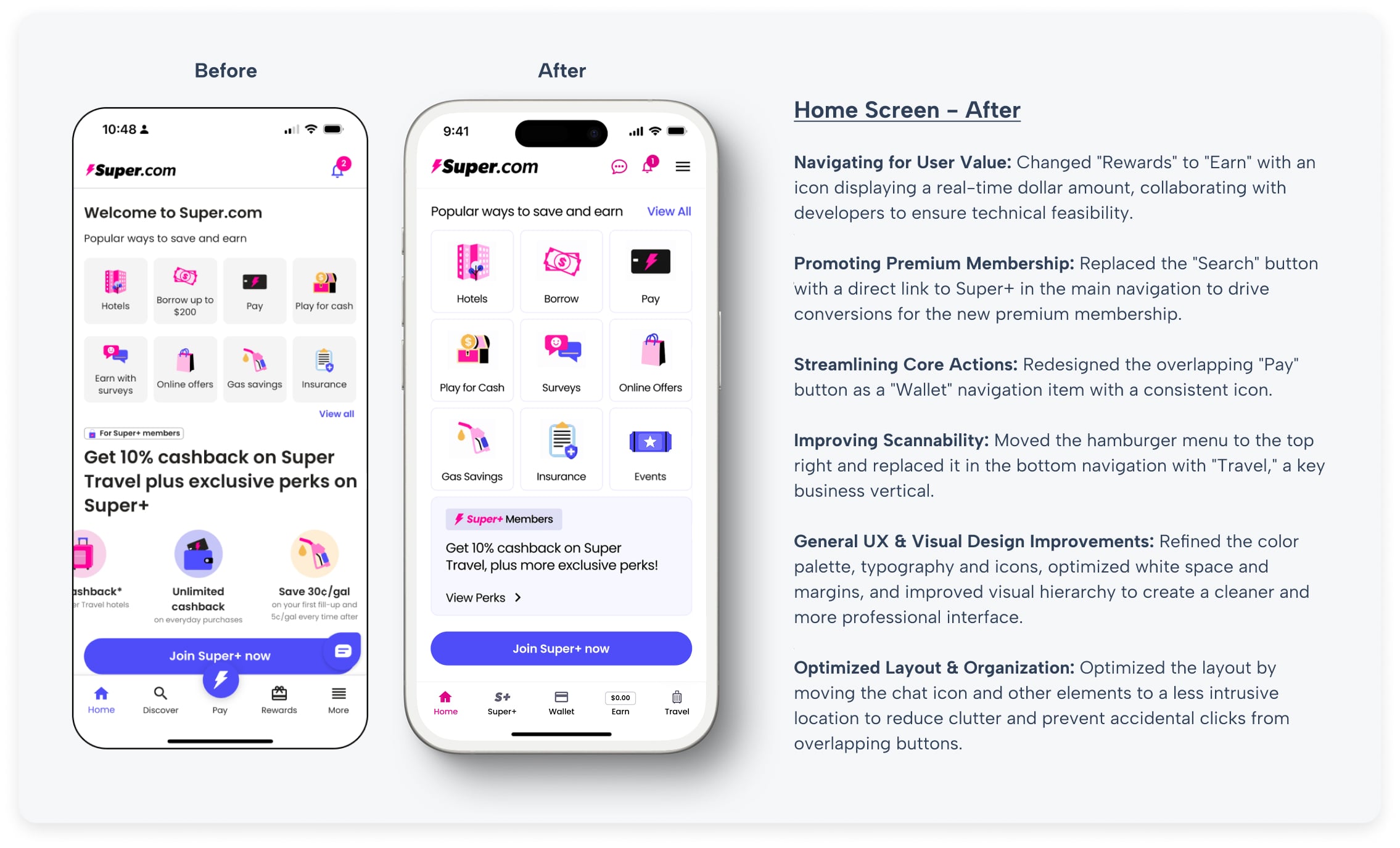
The prototype home screen suffered from a lack of visual hierarchy and consistency. Key issues included inconsistent color and spacing, varying icon styles and shapes, and misaligned elements. Some interactive elements were inconsistent, and overlapping buttons at the bottom of the screen contributed to a cluttered experience.

Key Objectives, Research Insights, and User Pain Points
The core business goal was to increase overnight bookings in Pierce County. Supporting objectives included improving mobile usability, surfacing high-value content like events and seasonal itineraries, and giving the DMO team more flexibility in how they told Tacoma’s story.
Research included analytics, stakeholder interviews, and competitive audits. Key pain points included:
- Content was difficult to find and poorly organized
- Navigation was overwhelming, especially on mobile
- Events and planning tools were underutilized and not promoted clearly
- Users lacked a quick, intuitive way to understand what Tacoma had to offer
Home Screen Changes
To improve the prototype, I established a consistent color palette using a single shade of black, refined the hierarchy through font sizing and weight adjustments, and redesigned icons and taglines for a more cohesive visual identity. Beyond the navigation, I addressed a number of core visual design issues. I refined the color palette and typography to improve readability and established a consistent visual hierarchy. I also optimized white space and margins to reduce clutter and create a cleaner, more professional interface. A key part of this overhaul was a complete redesign of the app's navigation to better align with user behavior and business goals.
Super Sign-Up Analysis
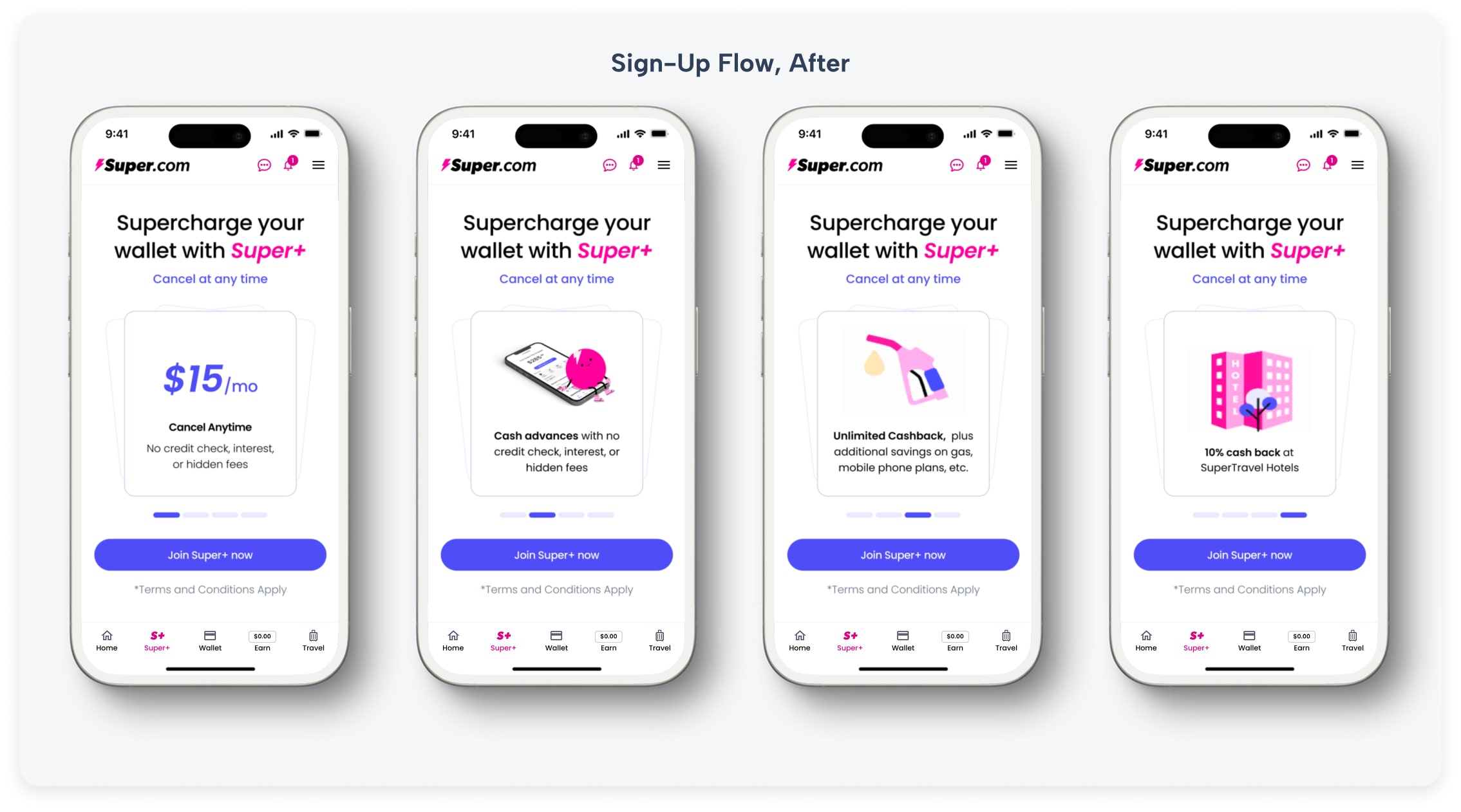
The existing sign-up flow had several usability issues, including redundant close icons, duplicate taglines, and a scroll design that obscured key information. Pricing and value propositions were not clearly presented, potentially causing confusion in a real-world scenario.

Optimized Sign-Up Flow
I designed an optimized sign-up flow to improve conversion rates and build trust. I kept the menu and navigation on the screen, as this page is a part of the overall navigation. To showcase the benefits of signing up, I opted for a micro slideshow with simple slides on a single page, allowing users to access the signup button at any time. By providing a clear and concise way to showcase the benefits in an easy-to-digest format, and using icons that match the brand's style, users are more likely to engage with the process and understand what they're getting from the start. I simplified the layout so all value propositions and the call-to-action were visible without scrolling. I replaced the double taglines with a single, clear message and made the pricing structure obvious. To reduce user anxiety, I also highlighted the "Cancel at any time" policy to build confidence and encourage sign-ups.
These improvements, along with clearer CTAs throughout the app and a direct link from the new "Super+" nav item, helped guide users into the new and more intuitive sign-up flow.
Additional Sign-Up Suggestions
As additional suggestions to enhance the sign-up experience, I added a back button to complement the swipe gesture, ensuring easy navigation. I also adjusted the input labels to improve readability and proposed a multi-step conversational style with a progress indicator to make the process more engaging. This approach makes the sign-up process feel more user-friendly and helps to prepare users for finalization.

Outcome & Reflections
These design recommendations improved the clarity, consistency, and usability of the Super.com prototype, providing a foundation for future iterations of the app. By prioritizing user-centered design and accessibility, the proposed updates supported a more intuitive experience and stronger visual consistency across key user flows. This project was a valuable experience in adapting to a fast-paced environment with a rapidly evolving product. It honed my ability to identify core usability issues quickly and to deliver strategic, high-impact design solutions for both user needs and business goals.

Visit Blacksmith Branding


