Key Objectives, Research Insights, and User Pain Points
The core business goal was to increase overnight bookings in Pierce County. Supporting objectives included improving mobile usability, surfacing high-value content like events and seasonal itineraries, and giving the DMO team more flexibility to tell Tacoma’s story.
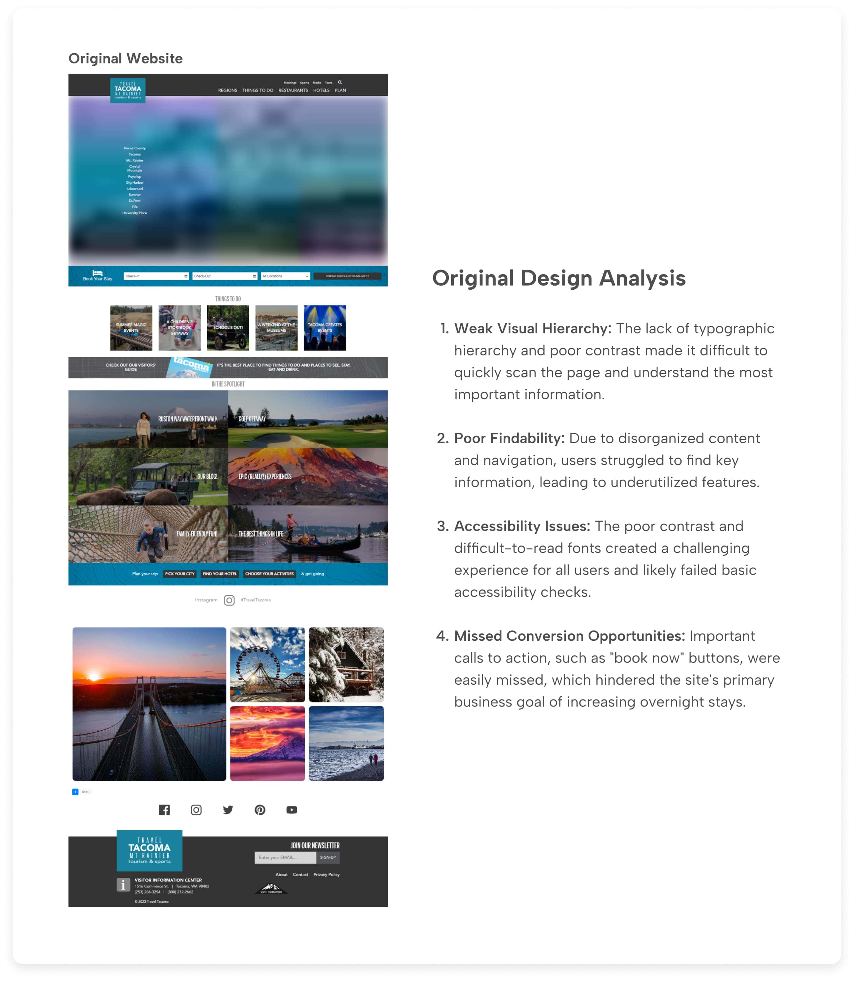
Research included analytics from the SEO team, stakeholder interviews, and competitive audits. Key pain points included:
• Content was difficult to find and poorly organized
• Navigation was overwhelming, especially on mobile
• Events and planning tools were underutilized and not promoted clearly
• Users lacked a quick, intuitive way to understand what Tacoma had to offer
Data-Informed Design Decisions

Design Approach
TL;DR: Guided an insight-driven, mobile first redesign that simplified trip planning through clearer navigation, organized regional content, improved visual design, and modular components, resulting in a flexible, user-centric platform designed to drive engagement and bookings.
──────────
Led end-to-end UX/UI strategy from initial concept through high-fidelity design and developer handoff.
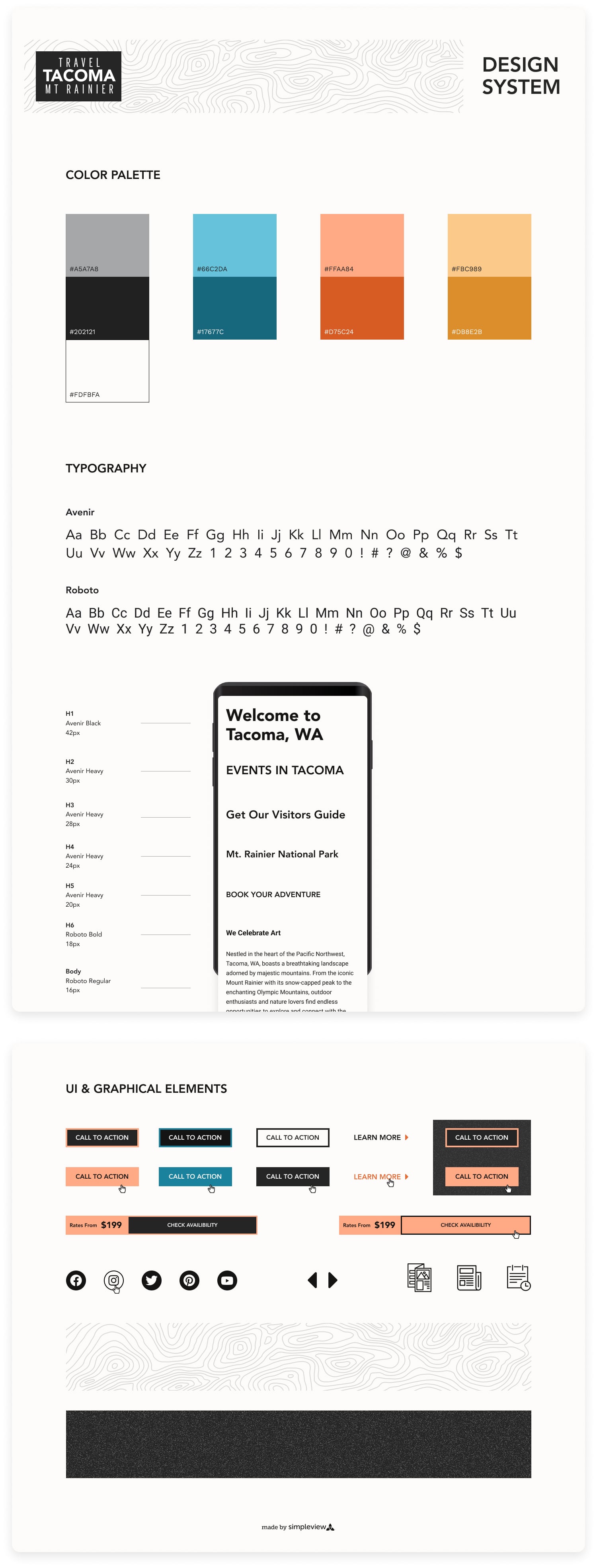
Designed a scalable design system for our CMS, ensuring consistency, client control, and flexibility without developer support.
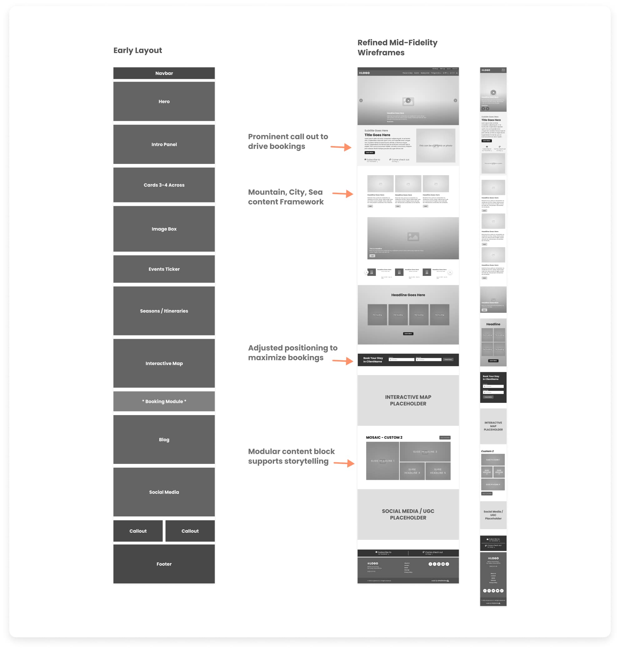
Introduced the strategic "Mountain, City, Sea" content framework to reorganize regional content and simplify key planning flows (events, trip ideas, things to do).
Optimized the core booking flow and event search to reduce drop-off and support clear calls-to-action.
Collaborated cross-functionally with Site Analysts and Developers to align all solutions with user needs and platform constraints.
Owned visual execution, expanding Tacoma's brand aesthetic and ensuring each reusable component supported Tacoma's content strategy, storytelling, and performance goals.
Wireframes
Below you can see the initial wireframes, where I applied a modular approach using our new master design system's component library. This not only ensured consistency across the experience but also provided a single source of truth for our cross-functional team, from early design reviews through to developer handoff.
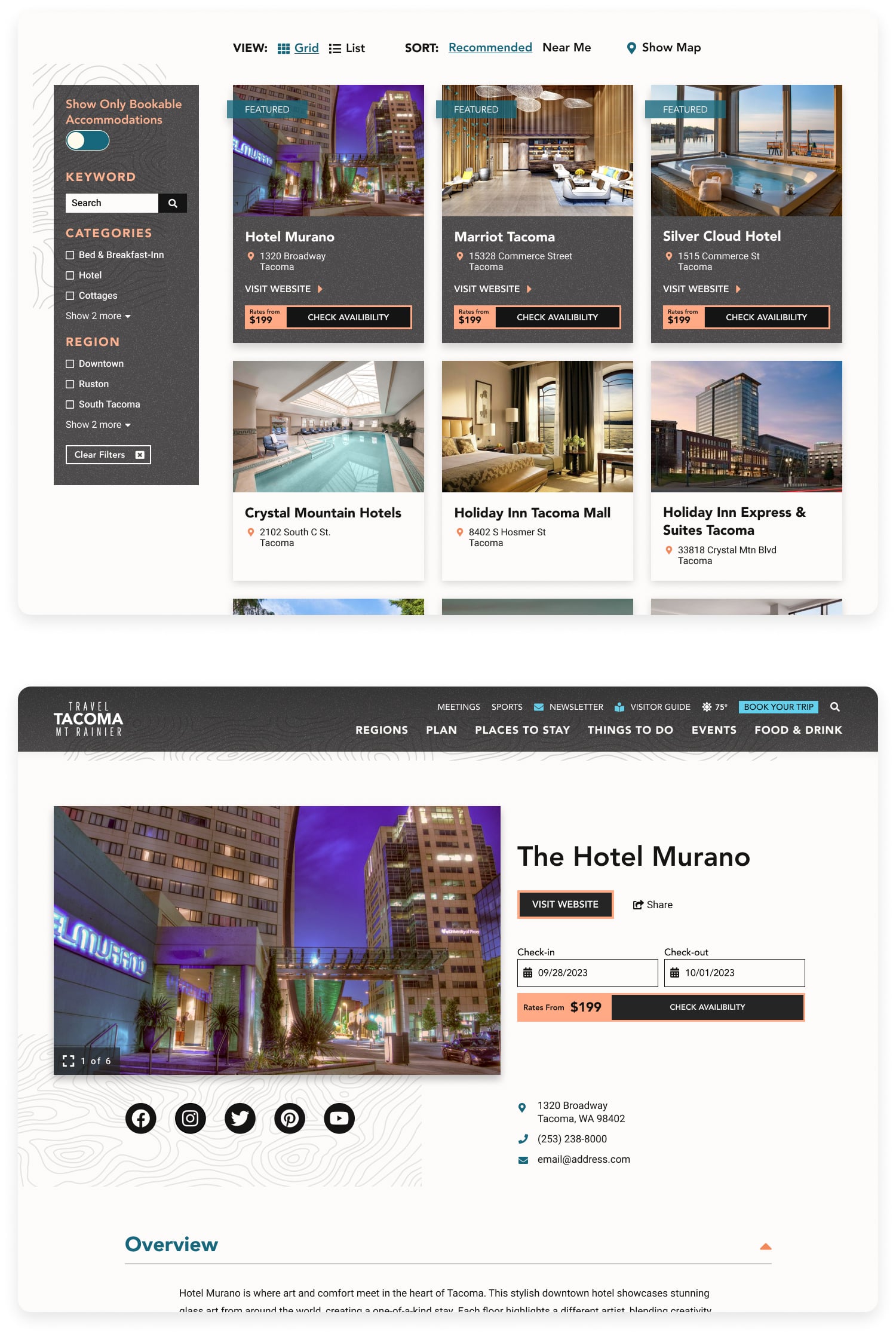
High-Fidelity Prototypes
Building on the approved wireframes, I transitioned the project into high-fidelity by applying the custom, component-based design system tailored to Travel Tacoma's brand. This phase brought the user-centric structure to life with detailed visual design, including color, typography, imagery, and micro-interactions. The resulting prototypes were not only key for final stakeholder approval but also served as the primary source of truth for the development team, ensuring seamless handoff and execution of the final user interface.
Key Objectives, Research Insights, and User Pain Points
The core business goal was to increase overnight bookings in Pierce County. Supporting objectives included improving mobile usability, surfacing high-value content like events and seasonal itineraries, and giving the DMO team more flexibility in how they told Tacoma’s story.
Research included analytics, stakeholder interviews, and competitive audits. Key pain points included:
- Content was difficult to find and poorly organized
- Navigation was overwhelming, especially on mobile
- Events and planning tools were underutilized and not promoted clearly
- Users lacked a quick, intuitive way to understand what Tacoma had to offer
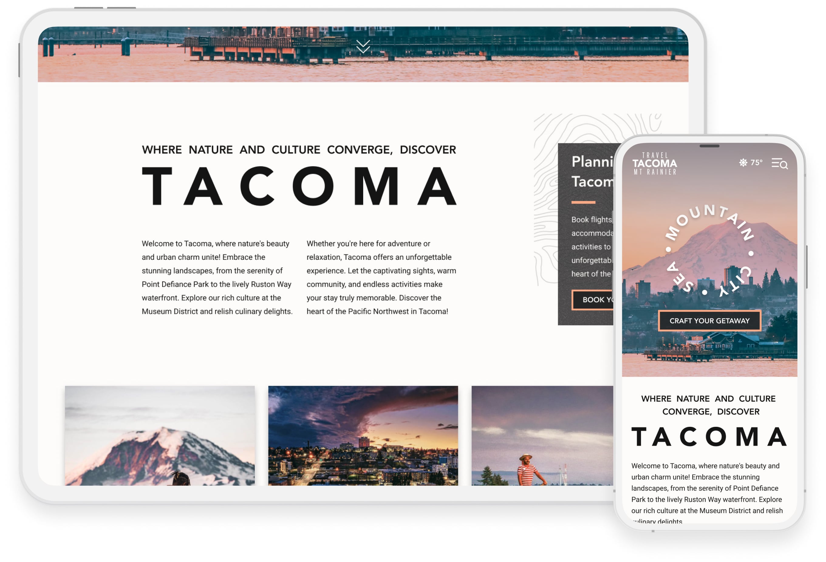
Homepage, Final Design
-min.jpg)
Final designs approved for developer handoff. (Live site may differ due to post-launch client edits.)
Build Phase & Challenges
I worked closely with developers throughout implementation to ensure performance, accessibility, and mobile responsiveness across the site. Midway through the build, internal process changes required scaling back some of my proposed animations and interactions to meet reduced development timelines. I helped navigate those changes, preserving the integrity of core flows and the design system and delivering a polished, high-performing final product that stayed on brand and on schedule.
Selected Mobile Screens

Outcome
TL;DR: Launched ahead of schedule with award-winning results and major gains in traffic, engagement, and bookings.
──────────
The Travel Tacoma redesign launched ahead of schedule and under budget, with the client approving designs at every stage with minimal revisions. The client was thrilled with the final product, which went on to earn a Gold dotCOMM Award for excellence in web design.
Post-launch reporting showed a 28% increase in organic traffic, a 40% lift in engagement on event pages, and a 37% increase in hotel referral clicks compared to the previous year. Key content like “Things to Do” and seasonal guides saw significant gains in visibility and time on page. Improved event discovery contributed to higher event engagement post-launch. Google Lighthouse performance metrics remained in the high 90s on both desktop and mobile, and Accessibility scores averaged 94 across pages.
The success of this project sparked new regional work and gave the client a scalable, user-focused platform that made it easier for visitors to explore, plan, and book while giving their team more control over how they presented the city’s story.

Visit Blacksmith Branding