Key Objectives, Strategic Insights, and Challenges
The main objective was to give the startup a strong digital presence that could clearly communicate its purpose in a new and fast-moving space. Supporting goals included building credibility with enterprise clients, attracting press and investor attention, and articulating the product's value without overwhelming users.
Strategic conversations revealed a few critical challenges:
• The platform operated in a space that few people fully understood
• Most existing competitors had sites that were jargon-heavy and visually uninspired
• The team needed a tone that felt intelligent but approachable
• The brand identity required refinement to better support digital storytelling
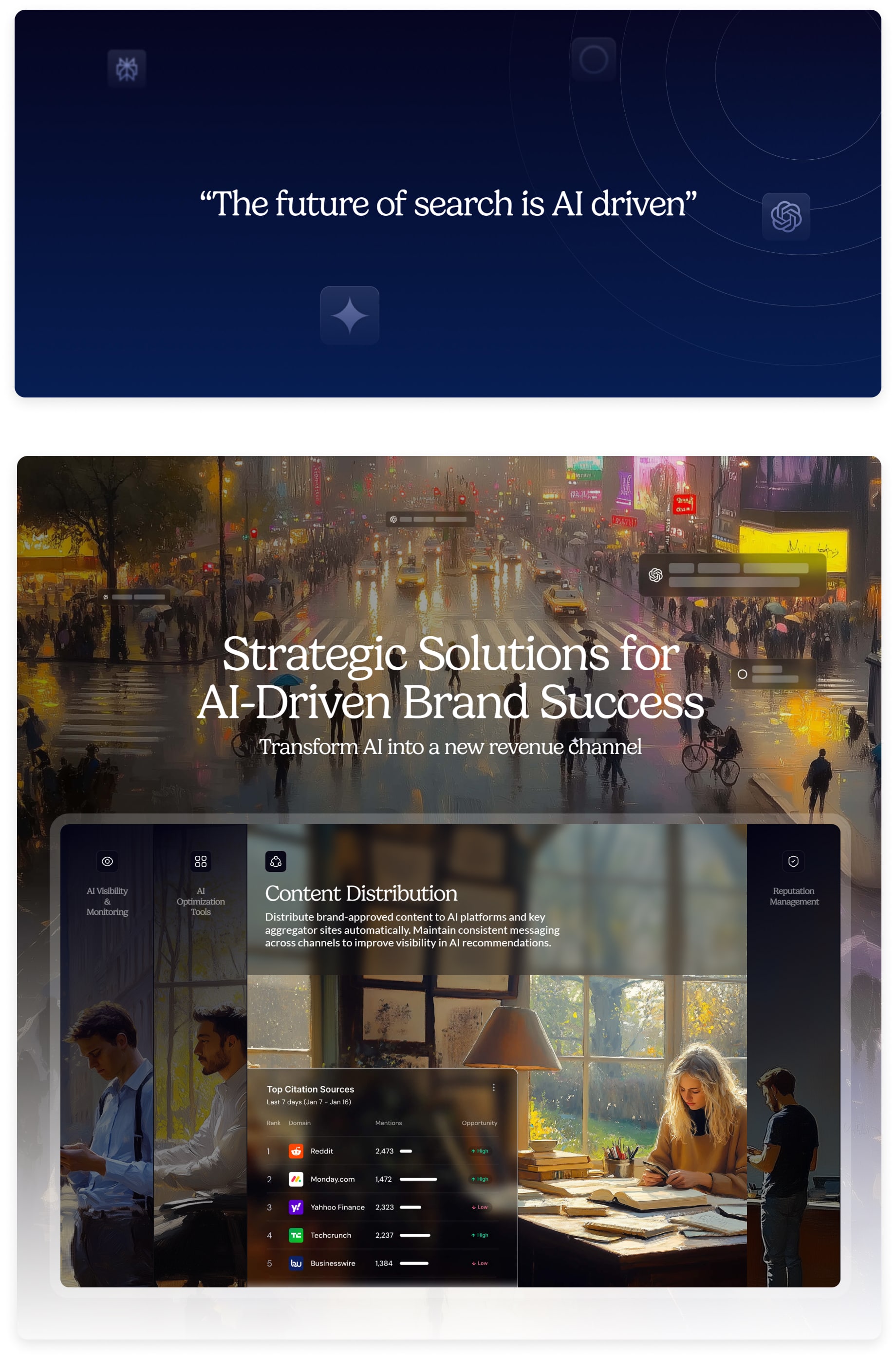
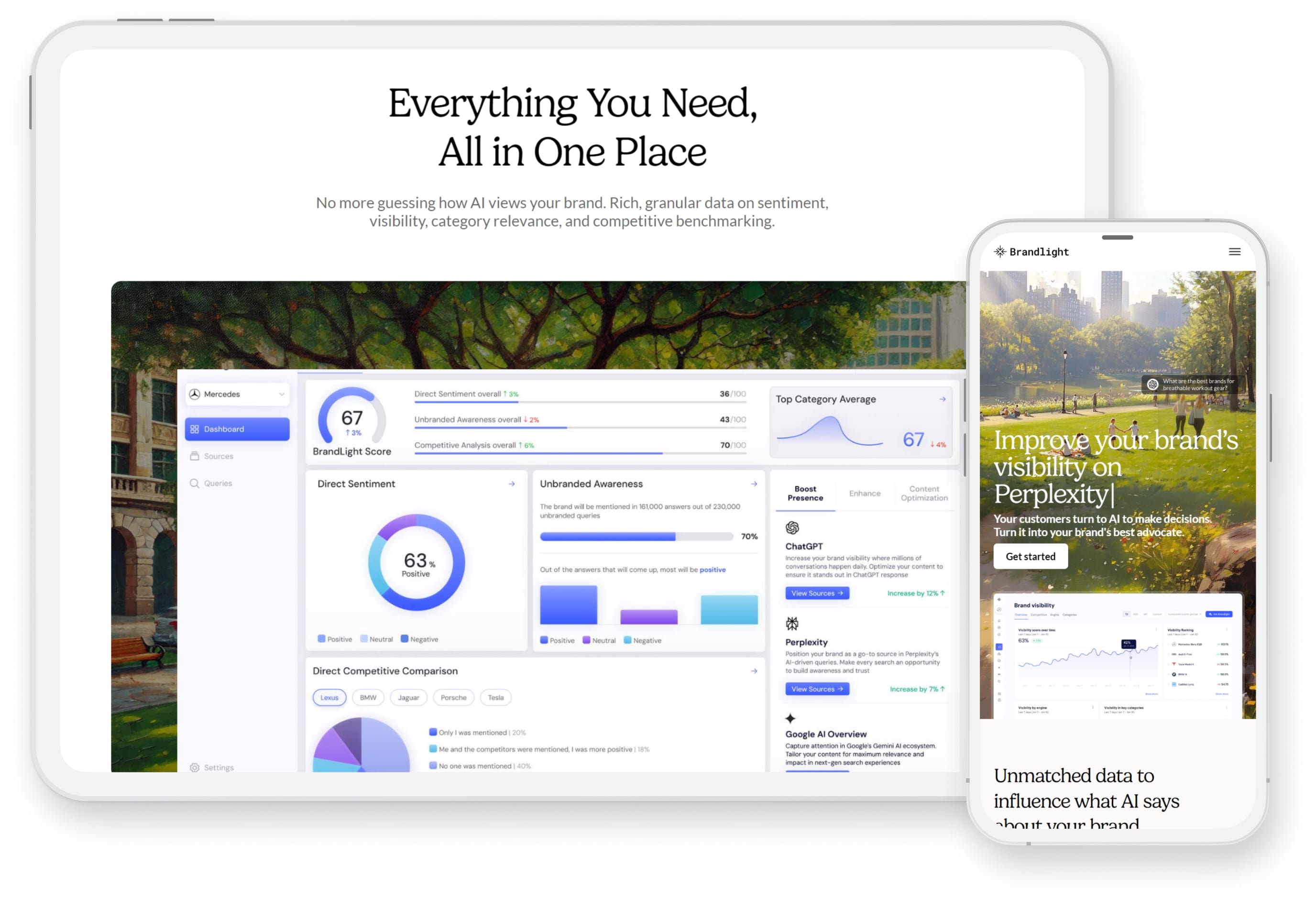
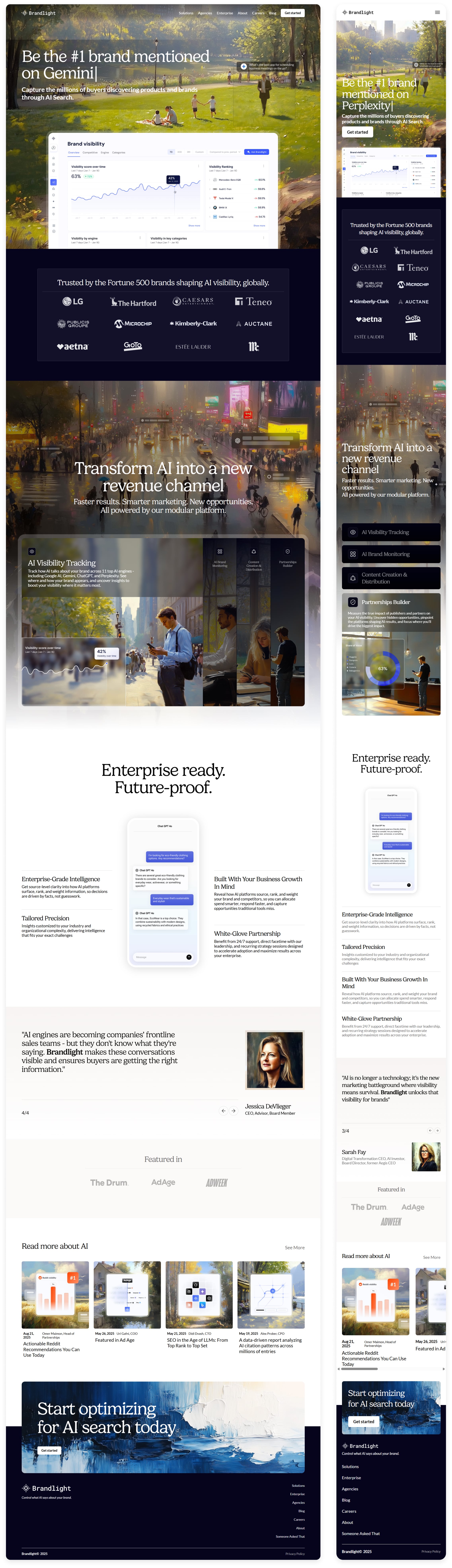
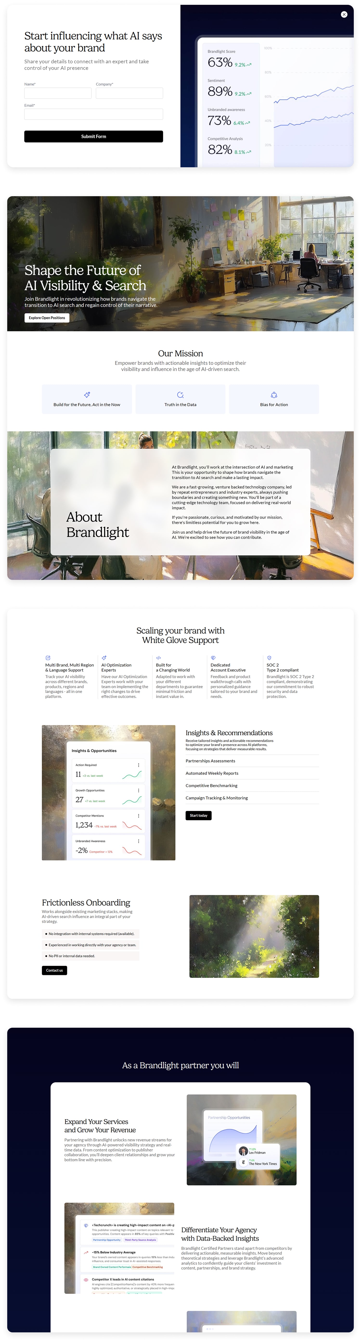
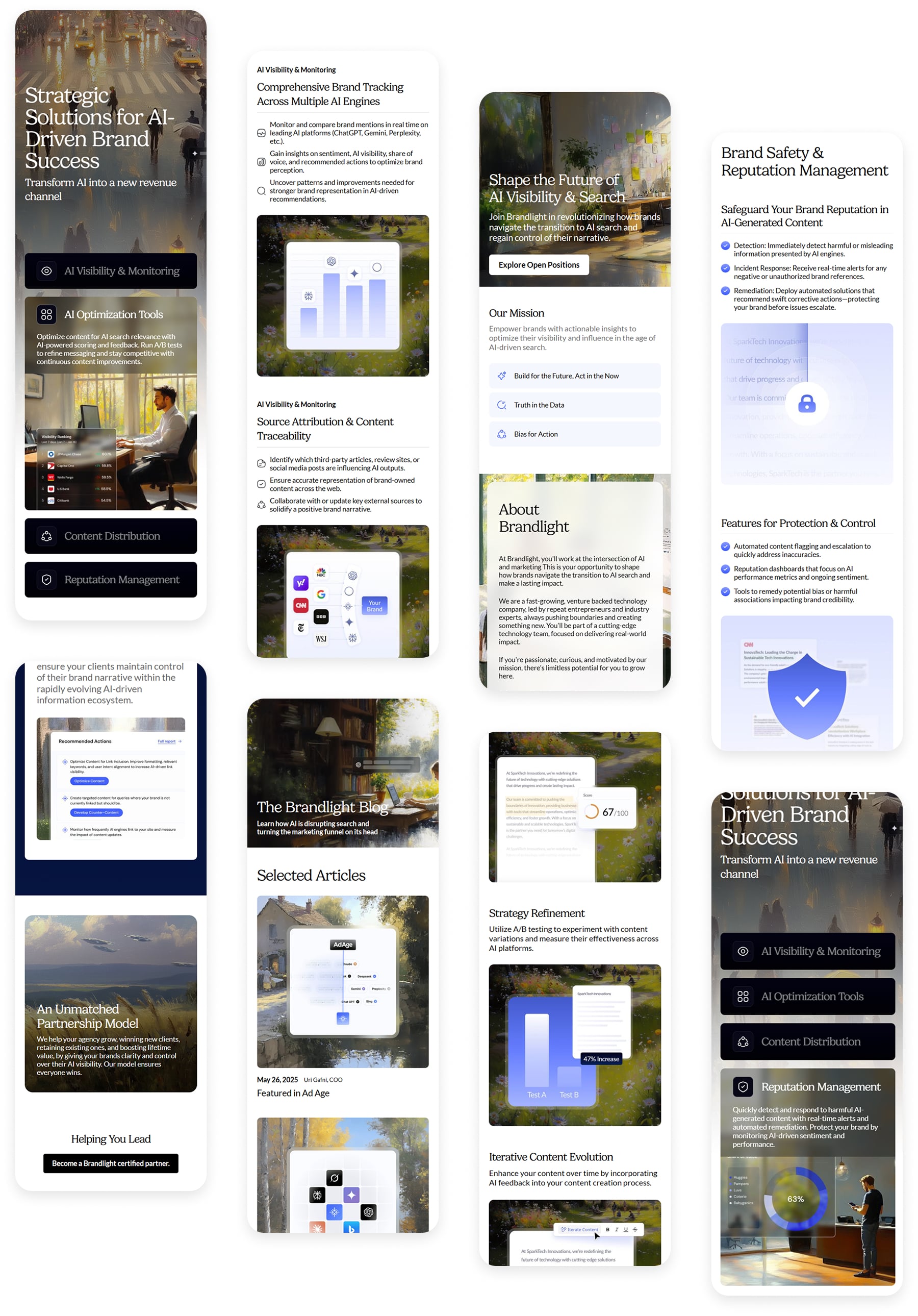
Design Approach
TL;DR: I built a clean, scalable design system and interface with smart visual pacing, thoughtful typography, and AI-stylized imagery to convey credibility, clarity, and modernity for an emerging brand in the AI search space.
──────────
I created a focused visual system built around clarity, space, and restraint. The layout architecture was designed to communicate technical depth without overwhelming the visitor. Onboarding paths, value propositions, and feature summaries were structured to support skimming while guiding toward deeper exploration. The site also needed to signal trust to both marketers and product teams, so hierarchy, tone, and rhythm were tuned carefully to feel both smart and grounded.
The typography pairs Gelica for headlines with Lato for supporting copy, creating a modern yet professional tone. A signature iris blue anchors the palette, with a few high-contrast accents used to emphasize key actions and insights. Imagery was stylized using AI-assisted effects to create an oil-painted texture, nodding to the blend of creative intelligence and technical sophistication behind the platform.
The result is a scalable, authoritative site that supports this company's mission to help businesses navigate the next era of search, where brand perception is shaped not just by traditional SEO, but by large language models.
Homepage
Key Objectives, Research Insights, and User Pain Points
The core business goal was to increase overnight bookings in Pierce County. Supporting objectives included improving mobile usability, surfacing high-value content like events and seasonal itineraries, and giving the DMO team more flexibility in how they told Tacoma’s story.
Research included analytics, stakeholder interviews, and competitive audits. Key pain points included:
- Content was difficult to find and poorly organized
- Navigation was overwhelming, especially on mobile
- Events and planning tools were underutilized and not promoted clearly
- Users lacked a quick, intuitive way to understand what Tacoma had to offer
Selected Mobile Screens
Outcome
The resulting site gave the company a polished, confident presence that helped define its voice in the early stages of growth. It also achieved a strong initial Homepage-to-Qualified Lead Submission conversion rate of 9%. The new design became a core asset for investor presentations, sales conversations, and press visibility. The founders were deeply satisfied with the outcome, and shortly after launch, the company secured $5.75 million in pre-seed funding to support the platform’s next phase of development.

Visit Live Site