Key Objectives, Research Insights, and User Pain Points
The site needed to serve a wide range of travelers, from day-trippers to history buffs to food-focused weekend visitors. Key goals included elevating arts and culinary tourism, promoting events, and creating better visibility for local businesses. Internal teams also needed more flexibility to manage seasonal campaigns and highlight different towns across the region. The client also wanted to incorporate Simpleview’s Trip Builder tool to support user itineraries and extended stays.
Through competitive audits, content analysis, and internal feedback, we identified several pain points: the previous site lacked visual warmth and hierarchy, events were hard to find, and high-value content like the online store was buried or visually disconnected from the brand.
Design Strategy
TL;DR: Crafted a warm, culture-rich design system that highlighted local arts, food, and businesses while blending refined typography, complementary colors, and strategic content themes to balance heritage with vibrancy.
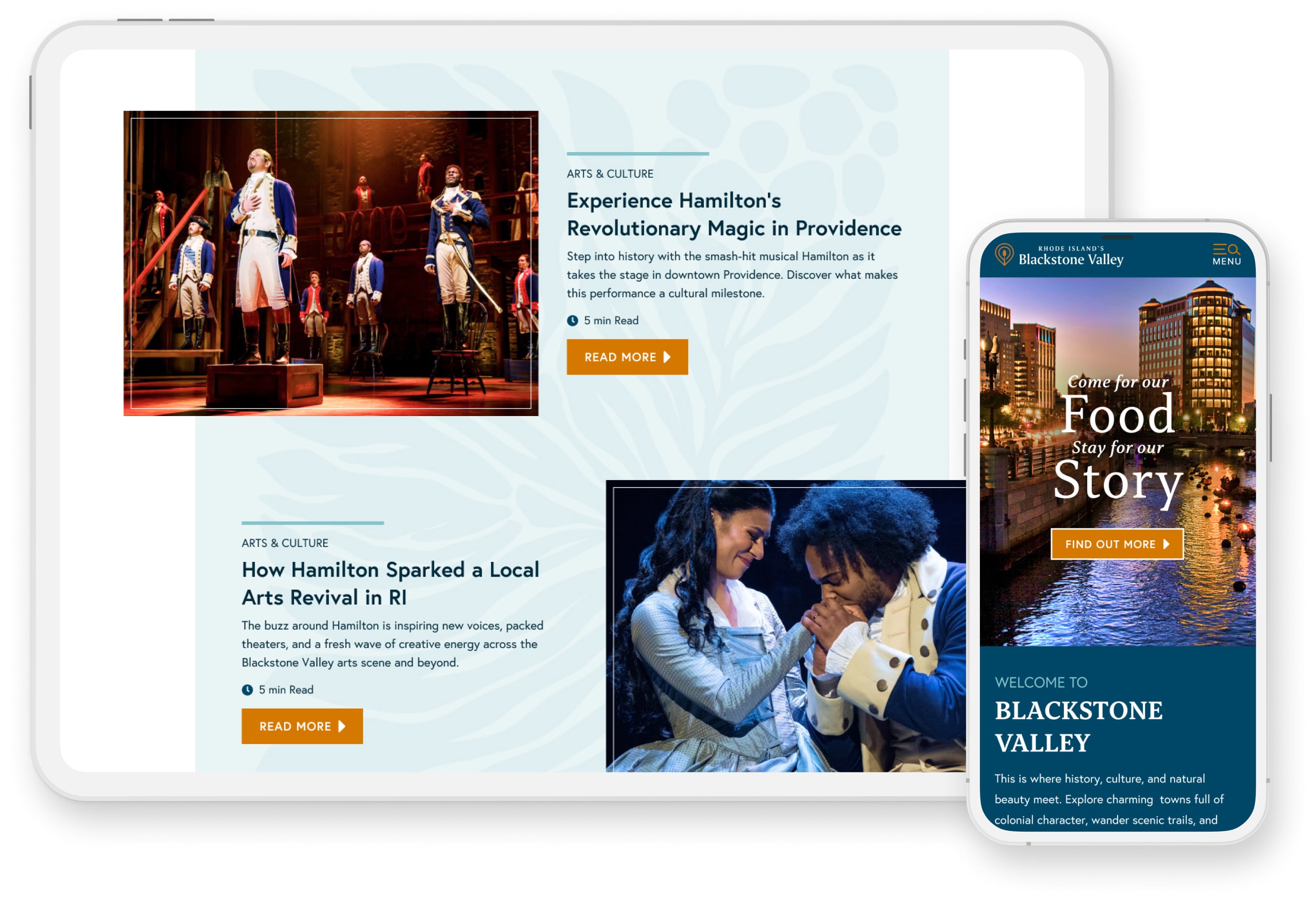
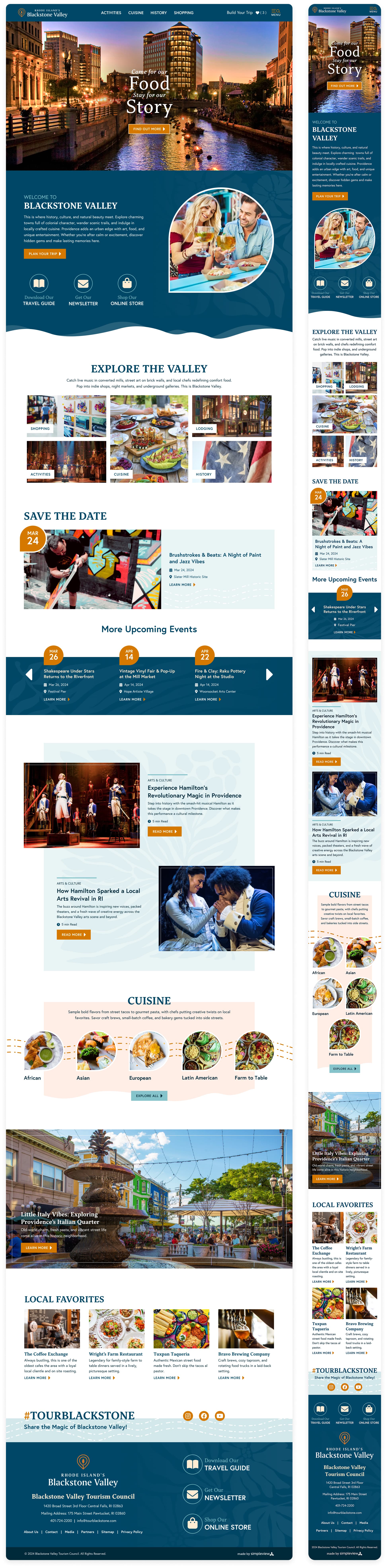
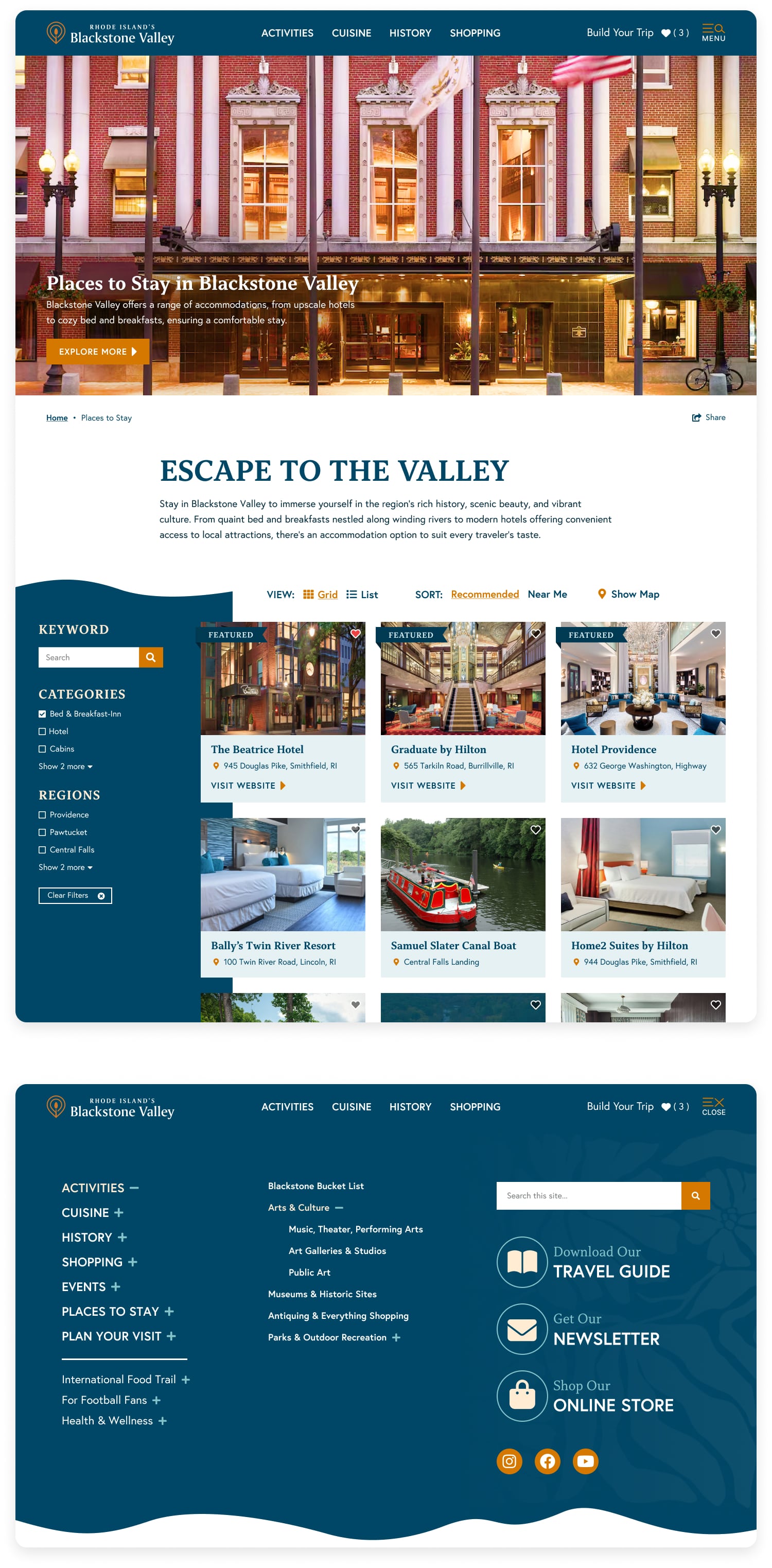
I aimed for a visual style that balanced artistic energy with a sense of local heritage that was refined but approachable. The homepage introduced a featured event area and a dynamic event ticker to surface the Valley’s busy calendar. I brought stronger focus to arts and cuisine, organizing content around themes like “Eat Local” and “Experience Culture,” while building in space to highlight small businesses and shopping.
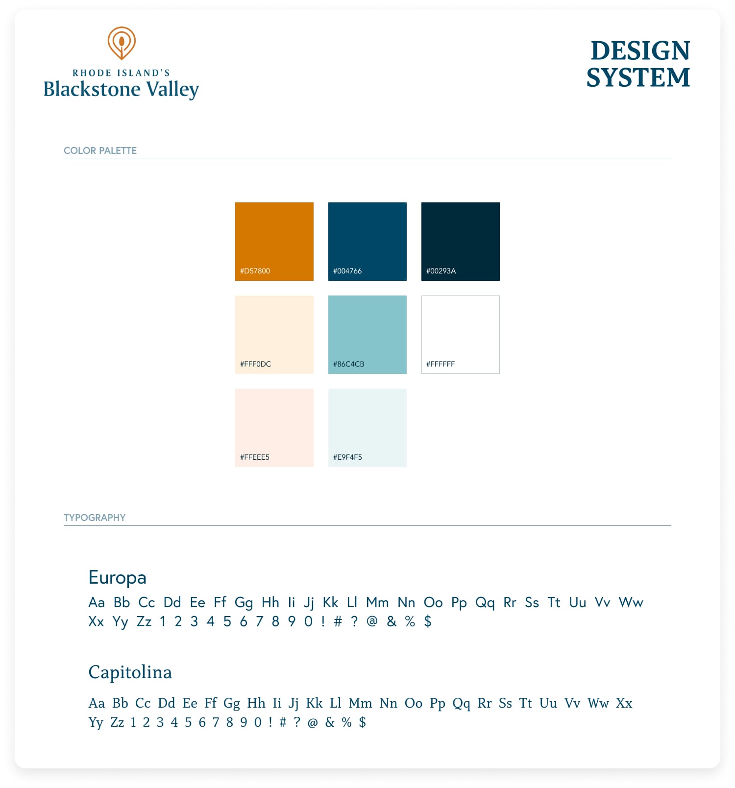
The color palette blended the brand’s deep blue with warmer complementary tones to create visual contrast and warmth. Subtle floral graphics, and elegant type helped position the region as both welcoming and sophisticated. I also ensured that the online store was easier to find and visually integrated into the brand, helping drive more traffic to that key revenue stream.
Homepage
Key Objectives, Research Insights, and User Pain Points
The core business goal was to increase overnight bookings in Pierce County. Supporting objectives included improving mobile usability, surfacing high-value content like events and seasonal itineraries, and giving the DMO team more flexibility in how they told Tacoma’s story.
Research included analytics, stakeholder interviews, and competitive audits. Key pain points included:
- Content was difficult to find and poorly organized
- Navigation was overwhelming, especially on mobile
- Events and planning tools were underutilized and not promoted clearly
- Users lacked a quick, intuitive way to understand what Tacoma had to offer
Final designs approved for developer handoff. (Live site may differ due to post-launch client edits.)
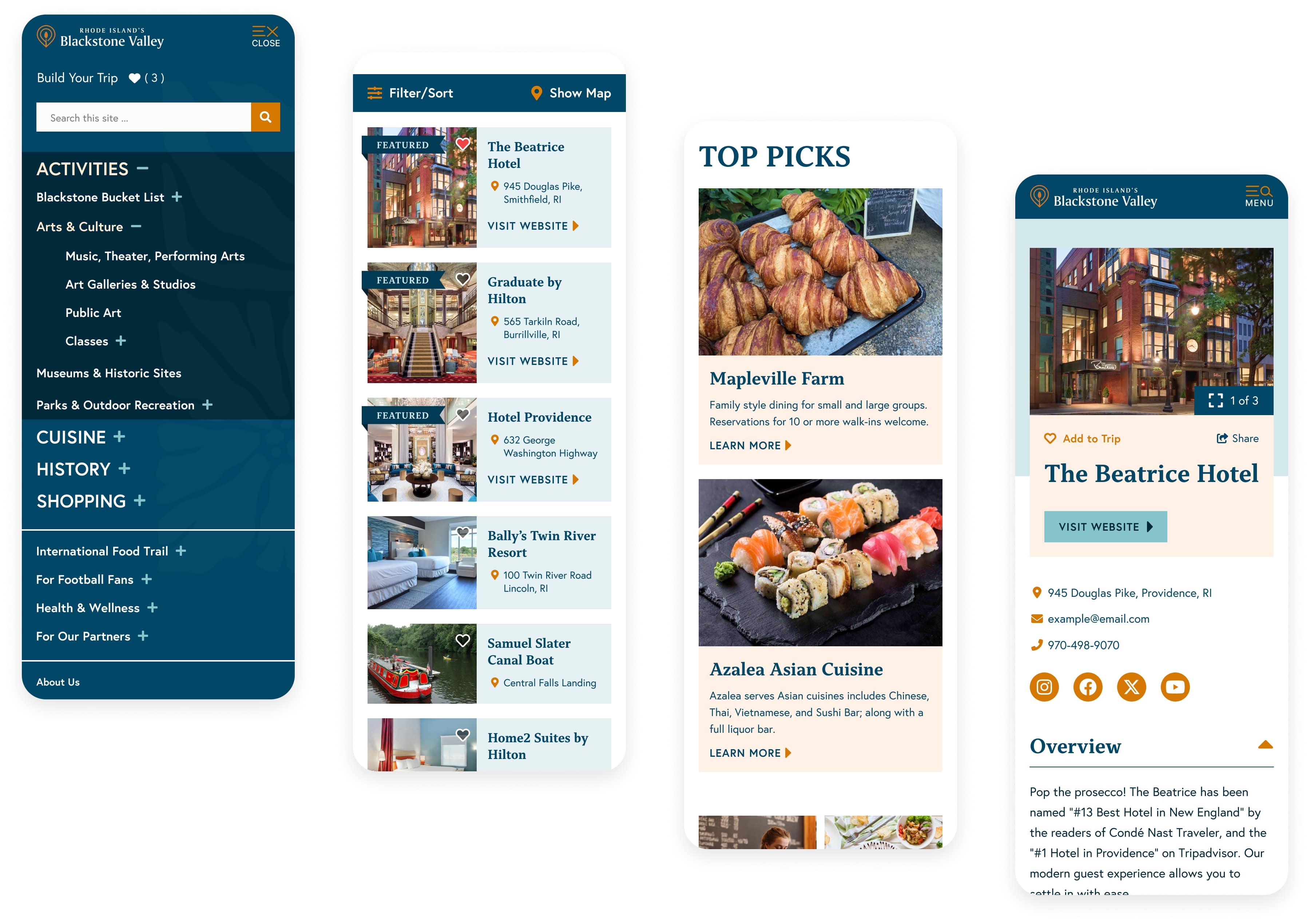
Selected Mobile Screens
Outcome
The redesigned Blackstone Valley site helped unify the region’s identity across town lines while spotlighting the stories, flavors, and experiences that make it unique. Post-launch results included a 24% increase in event page views, a 31% increase in engagement on arts and culture content, and a 19% increase in click-throughs to the online store. The refreshed layout made it easier for users to browse events, discover hidden gem businesses, and engage with cultural content in a format that felt clean, modern, and connected to place.

Visit Blacksmith Branding