Key Objectives, Research Insights, and User Pain Points
Key objectives included making it easier for visitors to plan trips, find ferry access, and understand what to expect on the island. Other priorities included improving mobile usability, giving local businesses more visibility, and creating a platform that could grow with the DMO’s needs.
Research and internal reviews revealed major friction points: the old site was cluttered, hard to navigate, and poorly optimized for mobile. Users struggled to find basic travel information, especially around transportation and lodging. Visuals were dated, and there was little brand personality or energy across the experience.
Design Strategy
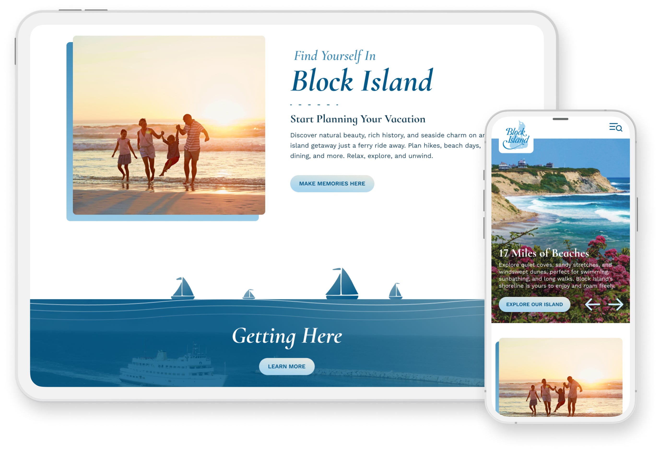
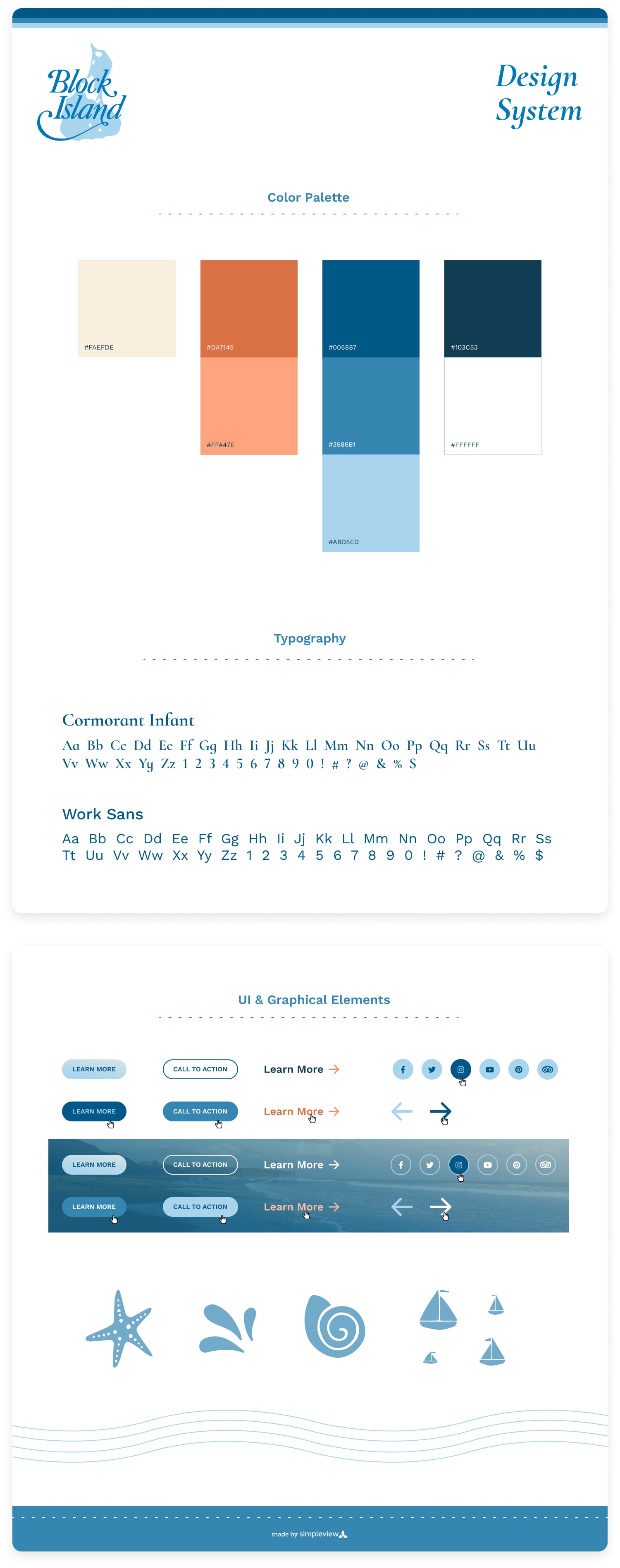
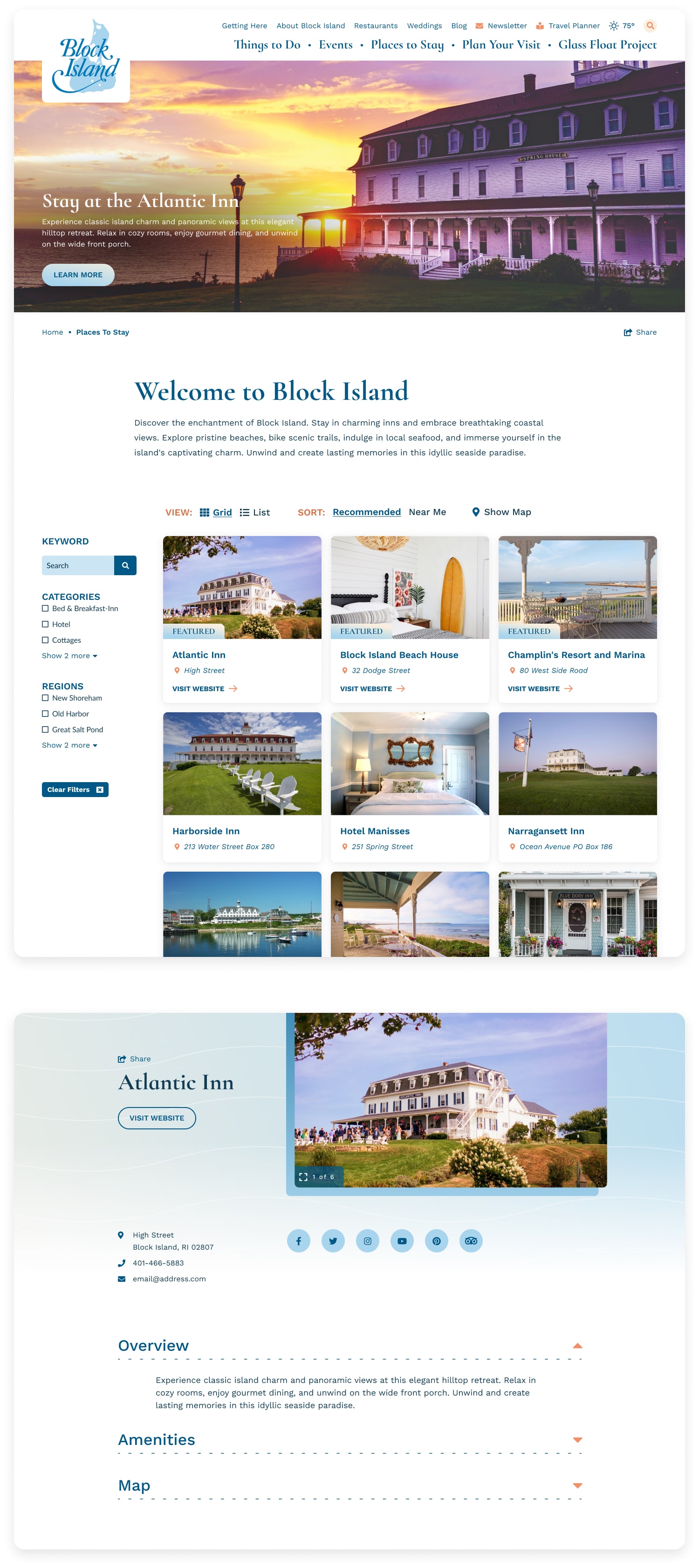
TL;DR: Crafted a clean, inviting interface inspired by the island’s natural palette, with playful details, streamlined navigation, and modular content blocks that made trip planning easier for users and updates easier for the client.
I kept the visual direction bright, breathable, and inspired by Block Island’s natural palette with coastal blues, sandy neutrals, warm sunset tones, and gentle gradients. I introduced subtle textures, custom illustrations, and a warm orange accent color to bring personality and playfulness to key content areas without overwhelming the clean layout.
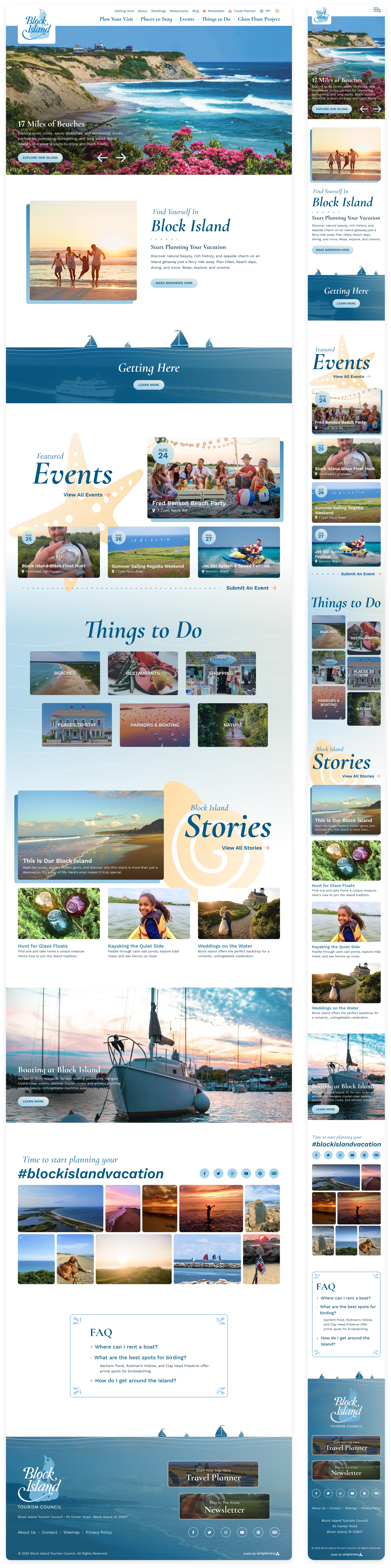
The navigation was restructured to surface essential trip-planning content, including a dedicated section for “Getting Here.” Modular content blocks made it easy for the internal team to manage promotions, community-focused features, and seasonal highlights. I also prioritized mobile readability and speed to ensure the site performed well across all devices and travel planning contexts.
Homepage
Key Objectives, Research Insights, and User Pain Points
The core business goal was to increase overnight bookings in Pierce County. Supporting objectives included improving mobile usability, surfacing high-value content like events and seasonal itineraries, and giving the DMO team more flexibility in how they told Tacoma’s story.
Research included analytics, stakeholder interviews, and competitive audits. Key pain points included:
- Content was difficult to find and poorly organized
- Navigation was overwhelming, especially on mobile
- Events and planning tools were underutilized and not promoted clearly
- Users lacked a quick, intuitive way to understand what Tacoma had to offer
Final designs approved for developer handoff. (Live site may differ due to post-launch client edits.)
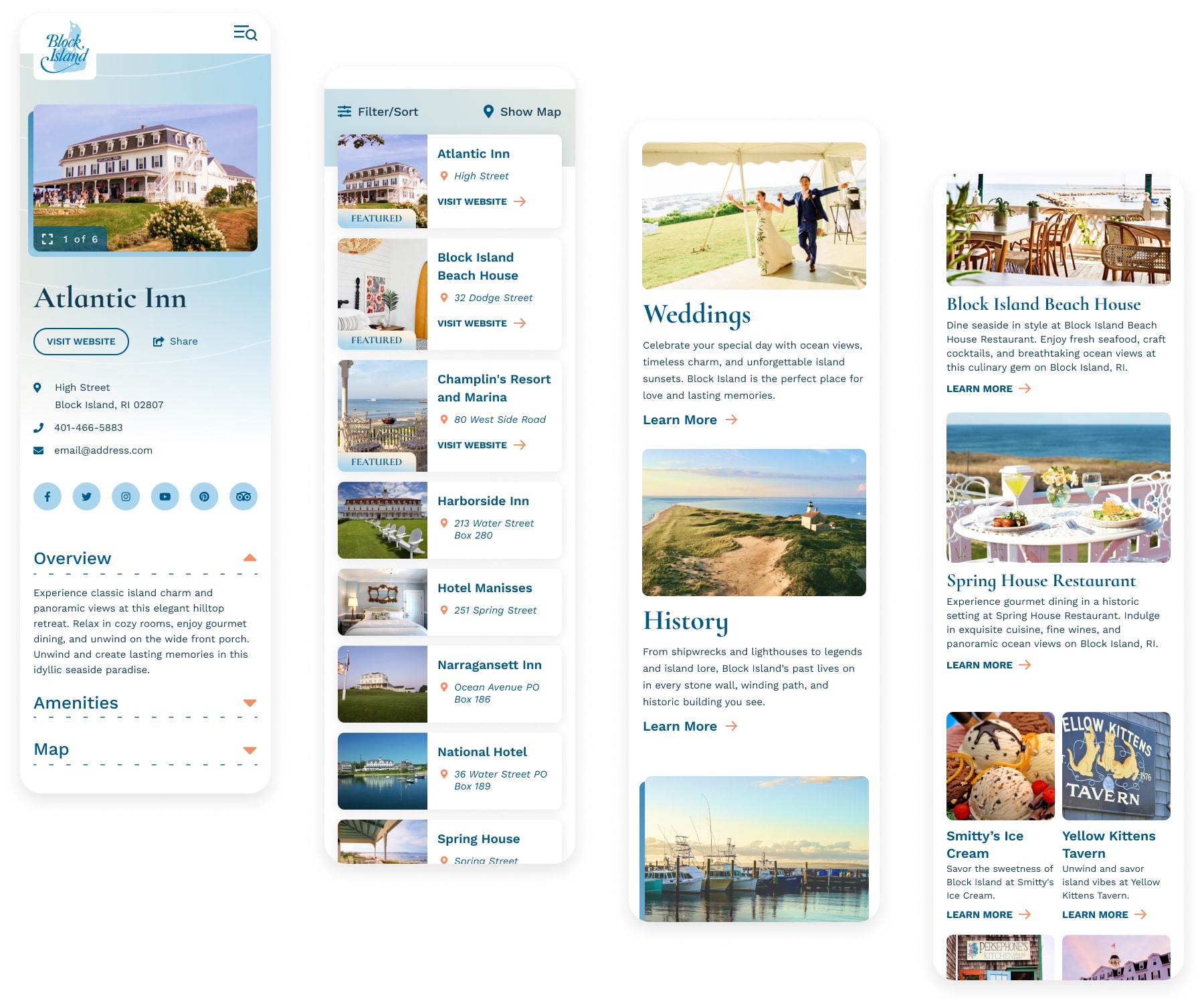
Selected Mobile Screens
Outcome
The redesigned Block Island site delivered a 34% increase in pageviews related to transportation and trip planning, a 32% lift in mobile engagement, and a 28% increase in partner referral clicks. Visitors spent more time on curated landing pages, and bounce rates dropped by 41% compared to the previous site. The clean design, simplified navigation, and added personality helped position Block Island as both beautiful and relaxed and gave the client a flexible, future-friendly platform to support tourism year-round.

Visit Blacksmith Branding