Key Objectives, Research Insights, and User Pain Points
The primary objective was to make the site easier to navigate and more inviting to explore. Other key goals included surfacing outdoor recreation content, supporting marketing campaigns, and improving mobile usability. Internal teams also needed better tools to update landing pages and campaign modules without relying on developers.
Analytics reviews and stakeholder feedback revealed that the old navigation was confusing and cluttered. Visitors had trouble finding essential planning content, and large areas of the homepage were going ignored. Pages for outdoor recreation, events, and local businesses weren’t getting the engagement they deserved.
Design Strategy
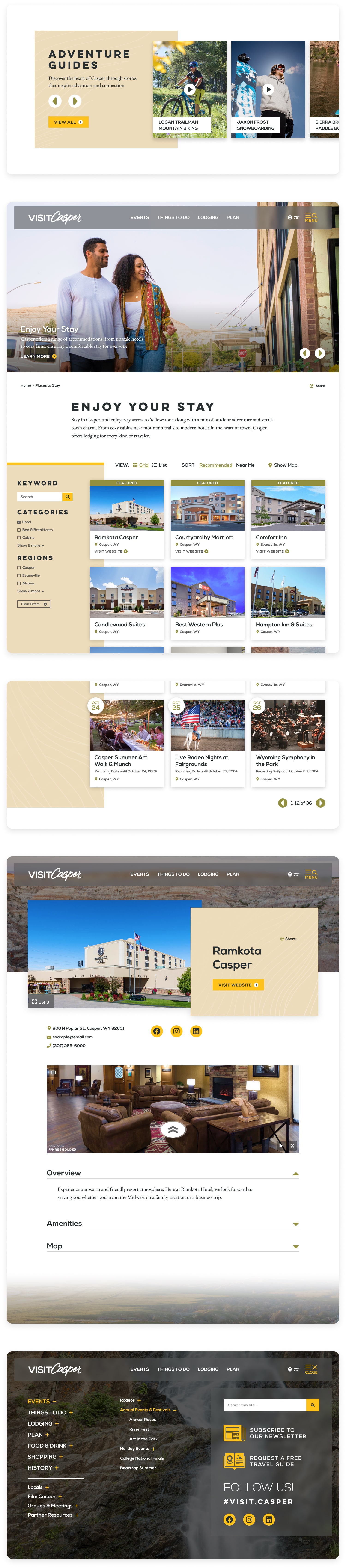
TL;DR: Redesigned Casper’s site with simplified navigation, flexible campaign modules, and a bold visual style that supported both trip planning and regional storytelling.
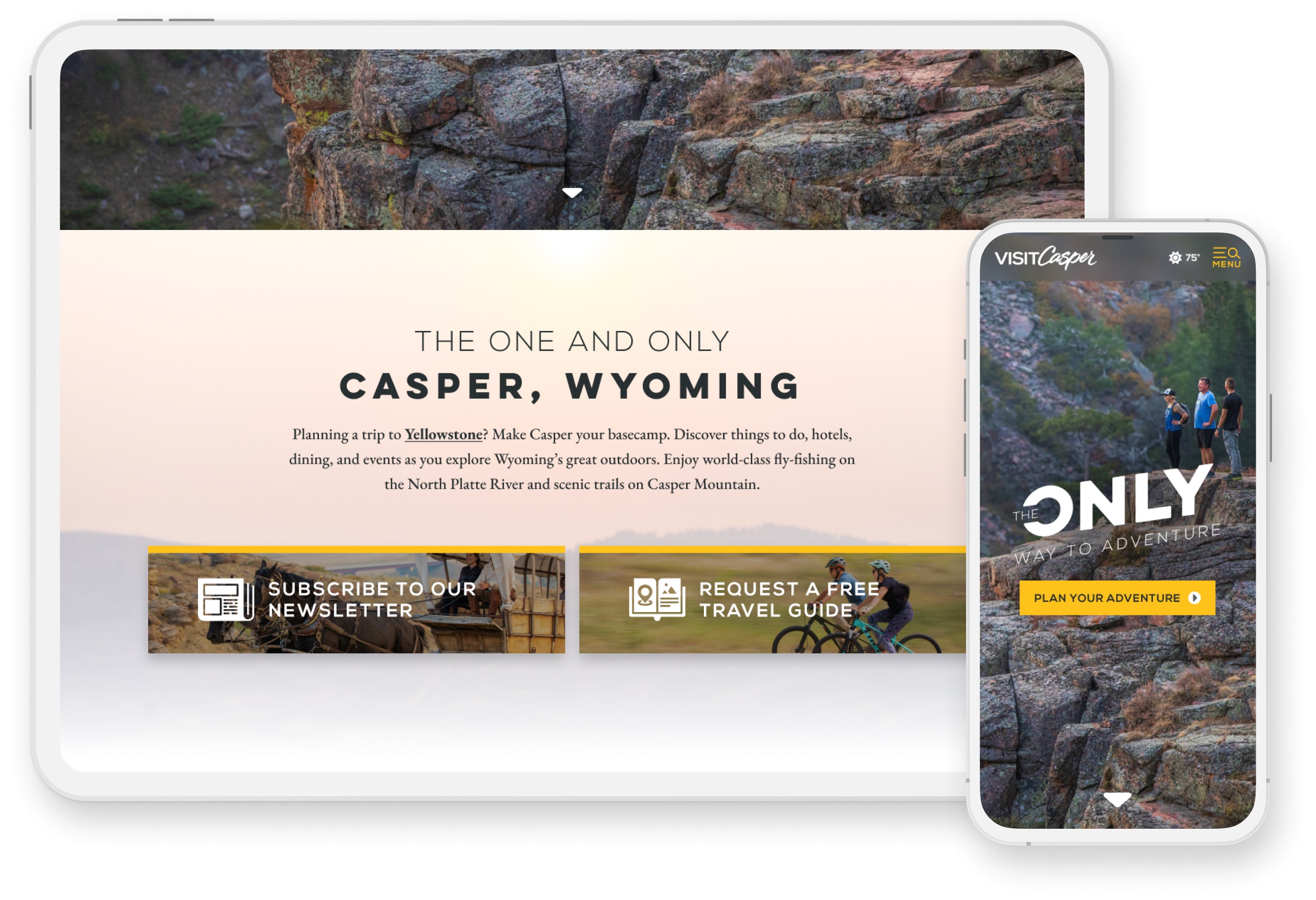
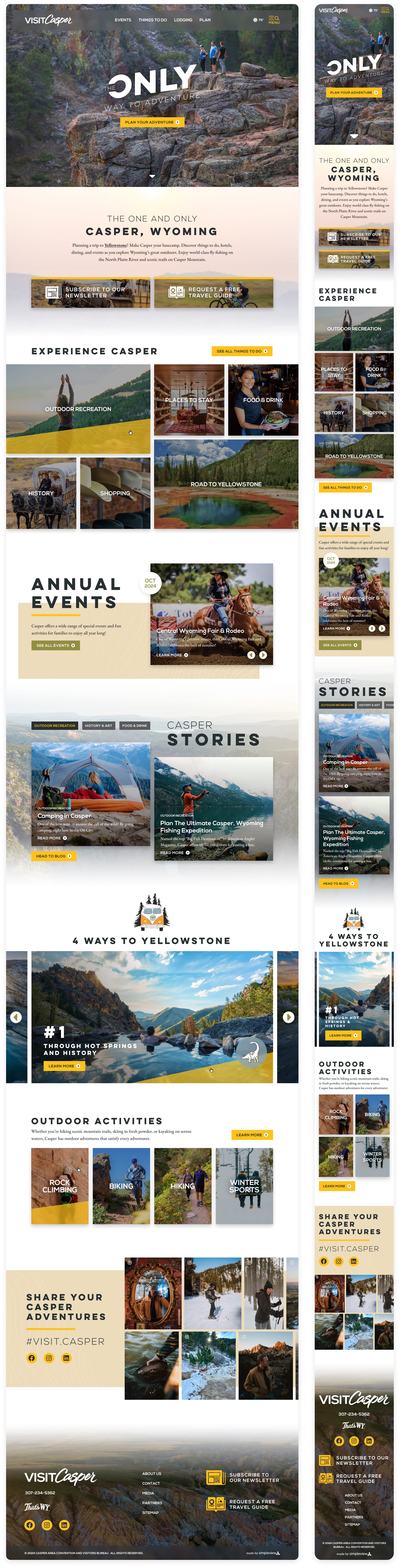
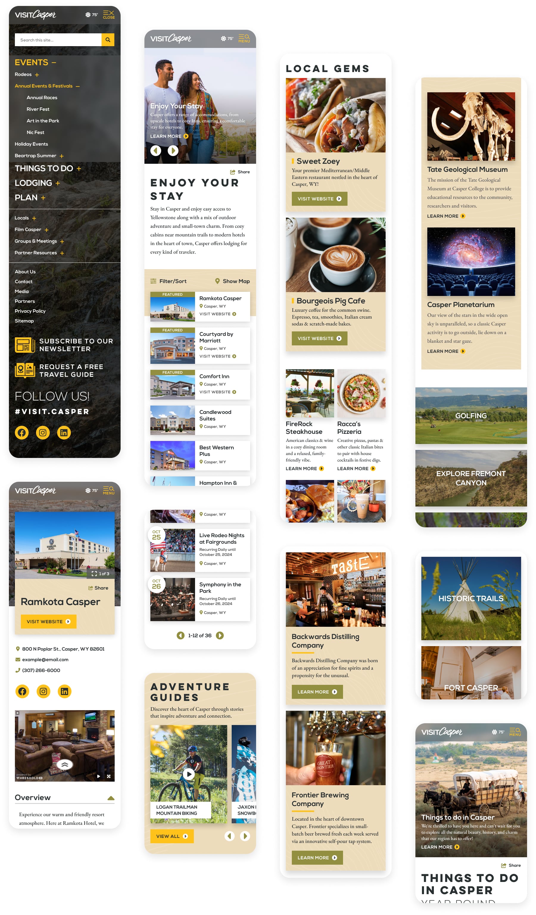
I started by streamlining the global navigation, reducing visual noise and reorganizing categories to reflect how real users plan trips. The new nav feels clean and approachable, especially on mobile, while still surfacing top content like Things to Do, Events, and Trip Ideas.
To support their “4 Ways to Yellowstone” campaign, I designed flexible promotional modules that could be toggled on or off and reused for future campaigns. These included stylized map graphics, thematic banners, and layout options for highlighting partner regions. The homepage also features simplified itineraries, local stories, and dynamic event listings to help first-time visitors and returning travelers find inspiration quickly.
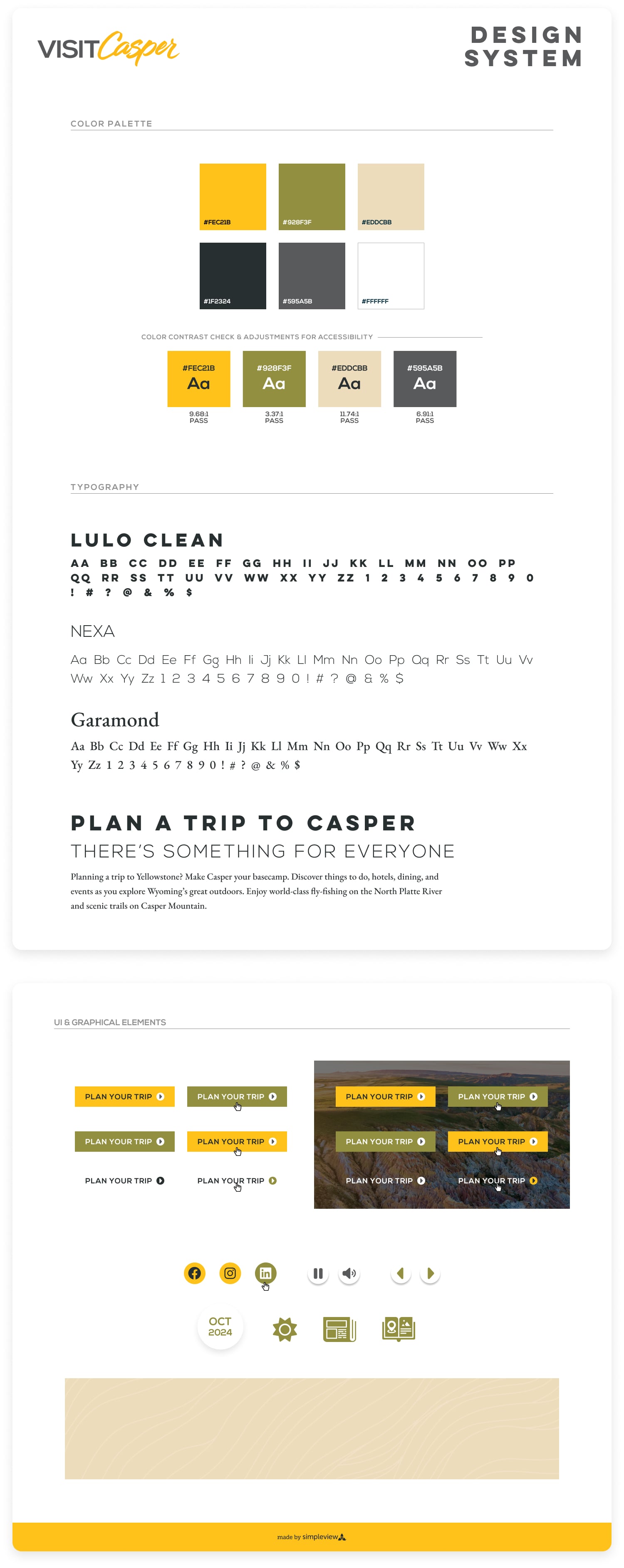
The visual language leans into Casper’s rugged charm with bold sans-serif headlines, abstract textured backgrounds, and high-contrast colors help convey a sense of adventure while staying warm and inviting.
Homepage
Key Objectives, Research Insights, and User Pain Points
The core business goal was to increase overnight bookings in Pierce County. Supporting objectives included improving mobile usability, surfacing high-value content like events and seasonal itineraries, and giving the DMO team more flexibility in how they told Tacoma’s story.
Research included analytics, stakeholder interviews, and competitive audits. Key pain points included:
- Content was difficult to find and poorly organized
- Navigation was overwhelming, especially on mobile
- Events and planning tools were underutilized and not promoted clearly
- Users lacked a quick, intuitive way to understand what Tacoma had to offer
Final designs approved for developer handoff. (Live site may differ due to post-launch client edits.)
Selected Mobile Screens
Outcome
The redesigned Visit Casper site saw a 26% increase in mobile sessions, a 33 percent lift in engagement on trip planning pages, and a 42% percent increase in clicks to partner destinations featured in the “4 Ways to Yellowstone” campaign. The simplified navigation improved usability across devices, and the modular design system made it easier for the marketing team to update content and launch future initiatives without additional dev work.

Visit Blacksmith Branding