Original Design Analysis
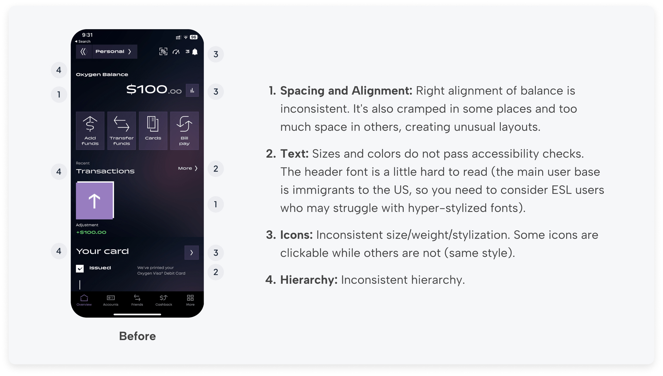
The first thing I noticed was that the home page was very low contrast overall (failing accessibility checks in multiple areas), the hierarchy and layout of sections were unusual (in a way that creates a less-than-intuitive user experience), and there was no information or call to action for upgrades (a point of focus for the new designs). Additionally, the bottom section of the screen seems to have a development issue that cuts off important information, and the fashion photo feels disconnected from the rest of the design and irrelevant to a banking app in general. I also think there should be at least one CTA to draw attention to other tiered products.
Wireframes
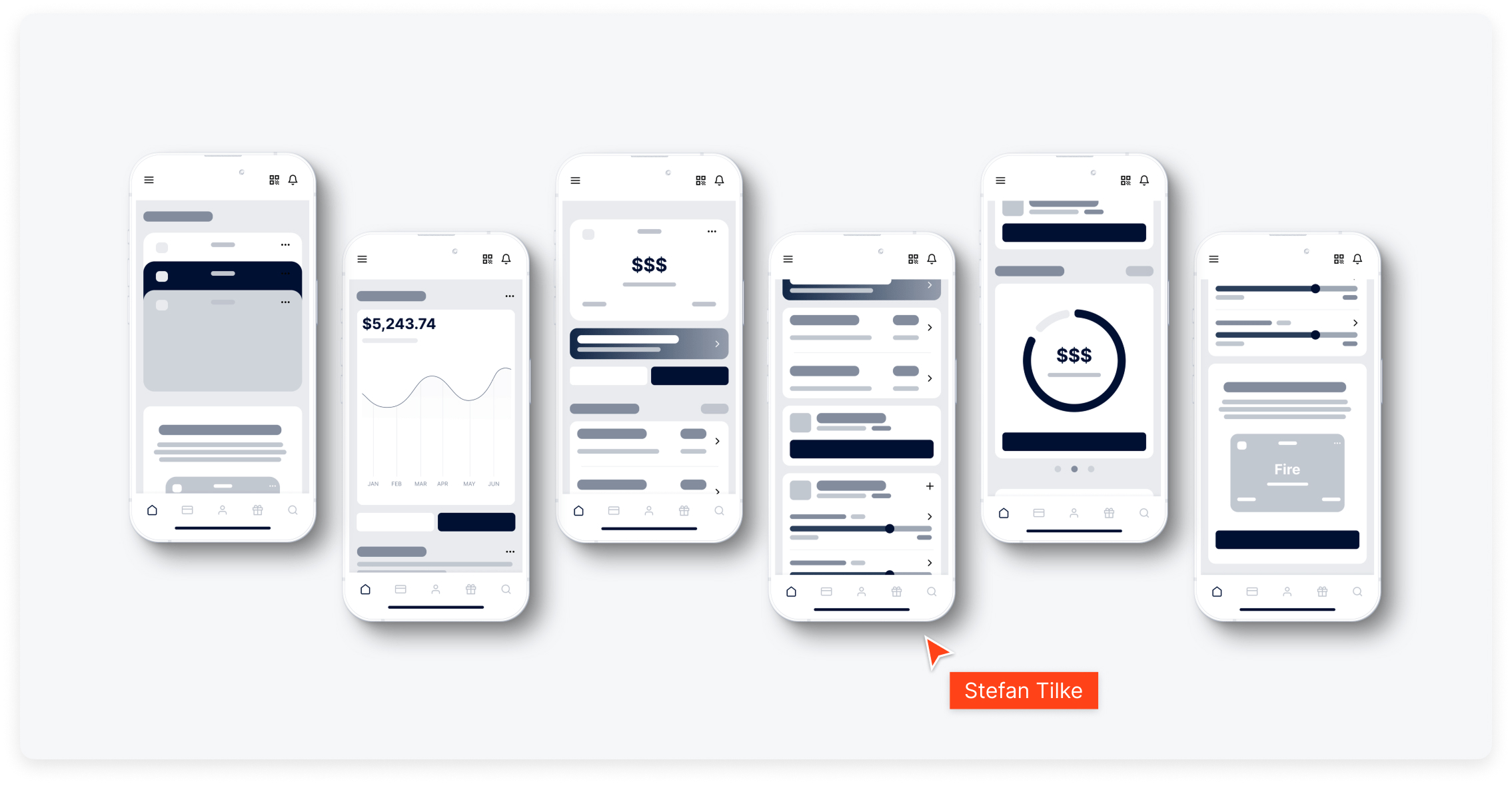
I wrote down a list of the sections and elements found on the original home screen. I used this information to re-order and combine sections to create each new layout as wireframes. Using this simple block method, I could make high-level decisions about section order and content within each section, all while getting a sense of different ways users might engage with each layout. Then I wireframed section layouts and created page variants by re-ordering sections.
Key Objectives, Research Insights, and User Pain Points
The core business goal was to increase overnight bookings in Pierce County. Supporting objectives included improving mobile usability, surfacing high-value content like events and seasonal itineraries, and giving the DMO team more flexibility in how they told Tacoma’s story.
Research included analytics, stakeholder interviews, and competitive audits. Key pain points included:
- Content was difficult to find and poorly organized
- Navigation was overwhelming, especially on mobile
- Events and planning tools were underutilized and not promoted clearly
- Users lacked a quick, intuitive way to understand what Tacoma had to offer
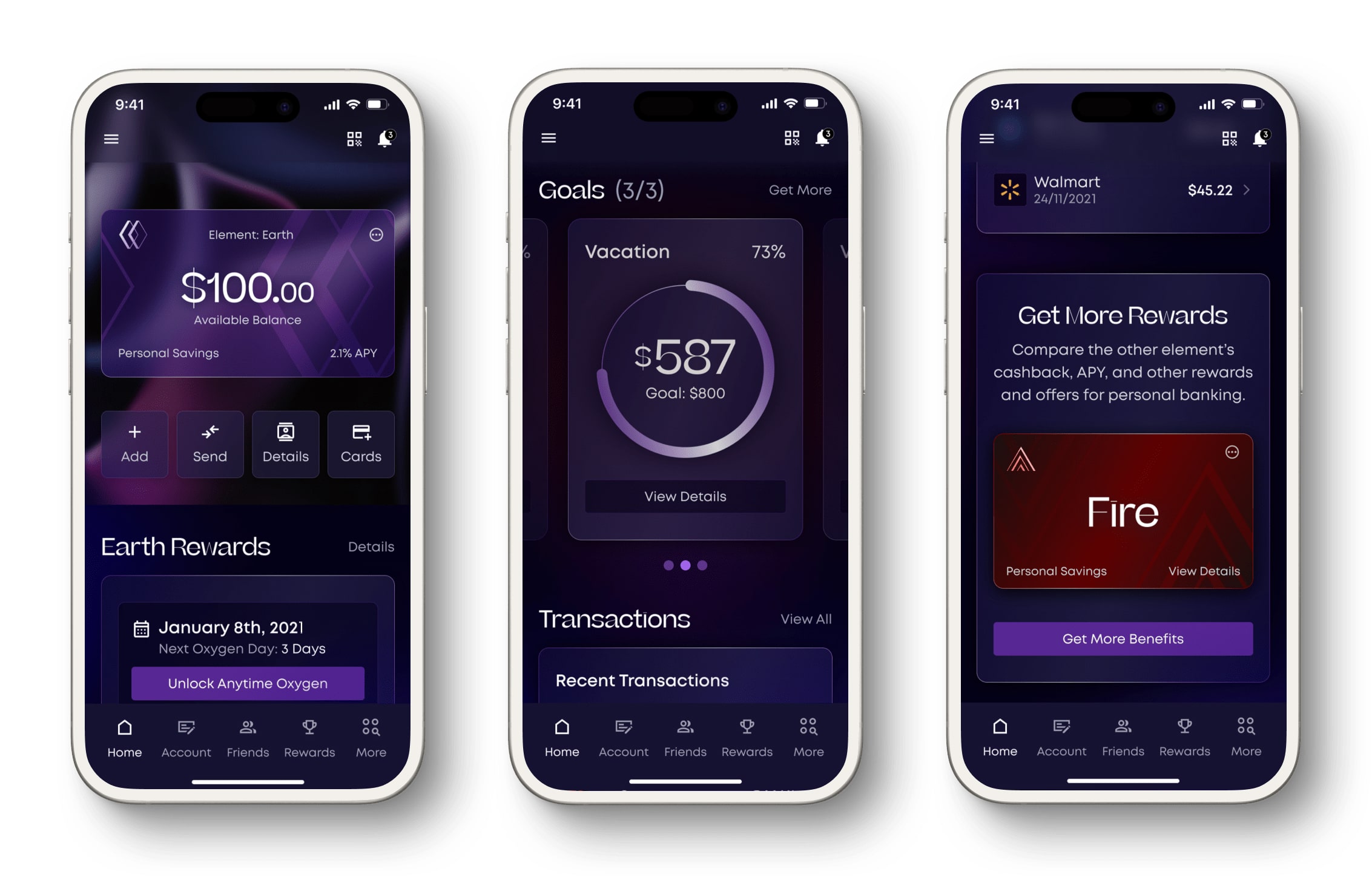
V1 High Fidelity
This variation utilizes a dark theme with updated, higher-contrast colors. It uses a glowing glass stylization without compromising on accessibility. It uses consistent icons size, weight, and style, and I reduced the amount of icons in the top navigation by placing less frequently used elements in the menu. I designed new layouts for each section, moved the rewards high on the page (since it’s a main feature of this page), and I added a CTA to upgrade to higher-tiered products. All text is legible, adheres to WCAG accessibility standards, and the styles establish an effective hierarchy.
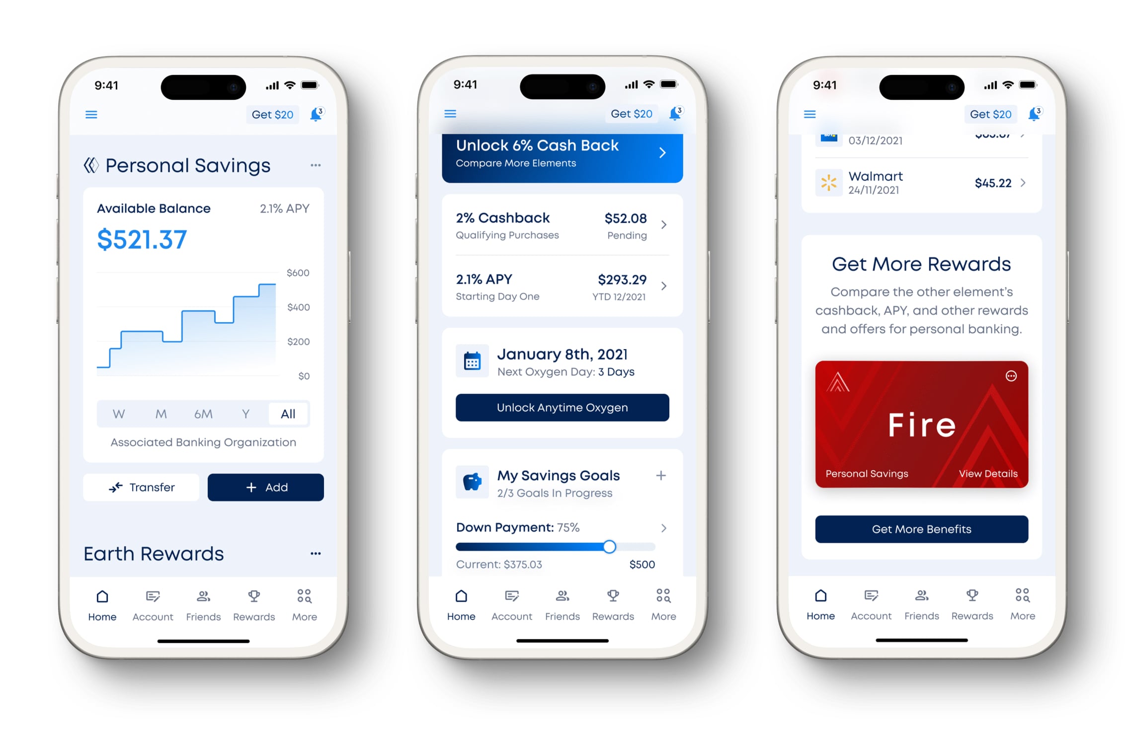
V2 High Fidelity
I used a light theme for this variation with colors and branding that align with the current Oxygen Website. It uses consistent icon size, weight, and style. I moved the rewards section up since it’s a main feature of this page and made your balance over time and your savings goals easy to understand at a glance. All text is legible, adheres to WCAG accessibility standards, and the styles establish an effective hierarchy.
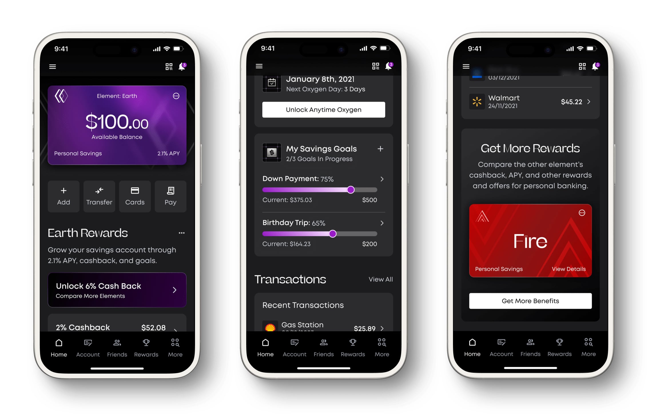
V3 High Fidelity
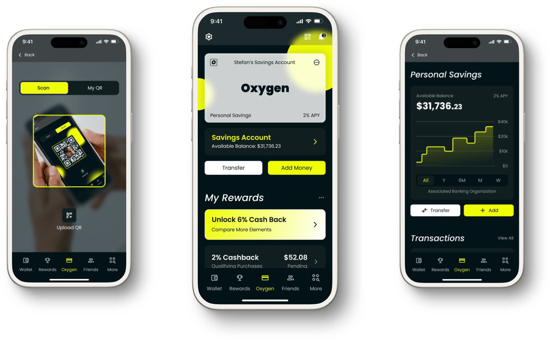
This variation utilizes a dark minimal theme with higher contrast overall and more saturated colors than the original. It also has an animated background element in the header for added visual interest. It uses consistent icon size, weight, and style, and I reduced the amount of icons in the top navigation by placing less frequently used elements in the menu. For this variation, I moved the rewards section up since it’s a main feature of this page and made the benefits easy to understand at a glance and then combined the goals and rewards sections since they’re both part of the benefits program. I used progress bars to simplify goal data visualization. All text is legible, adheres to WCAG accessibility standards, and the styles establish an effective hierarchy.
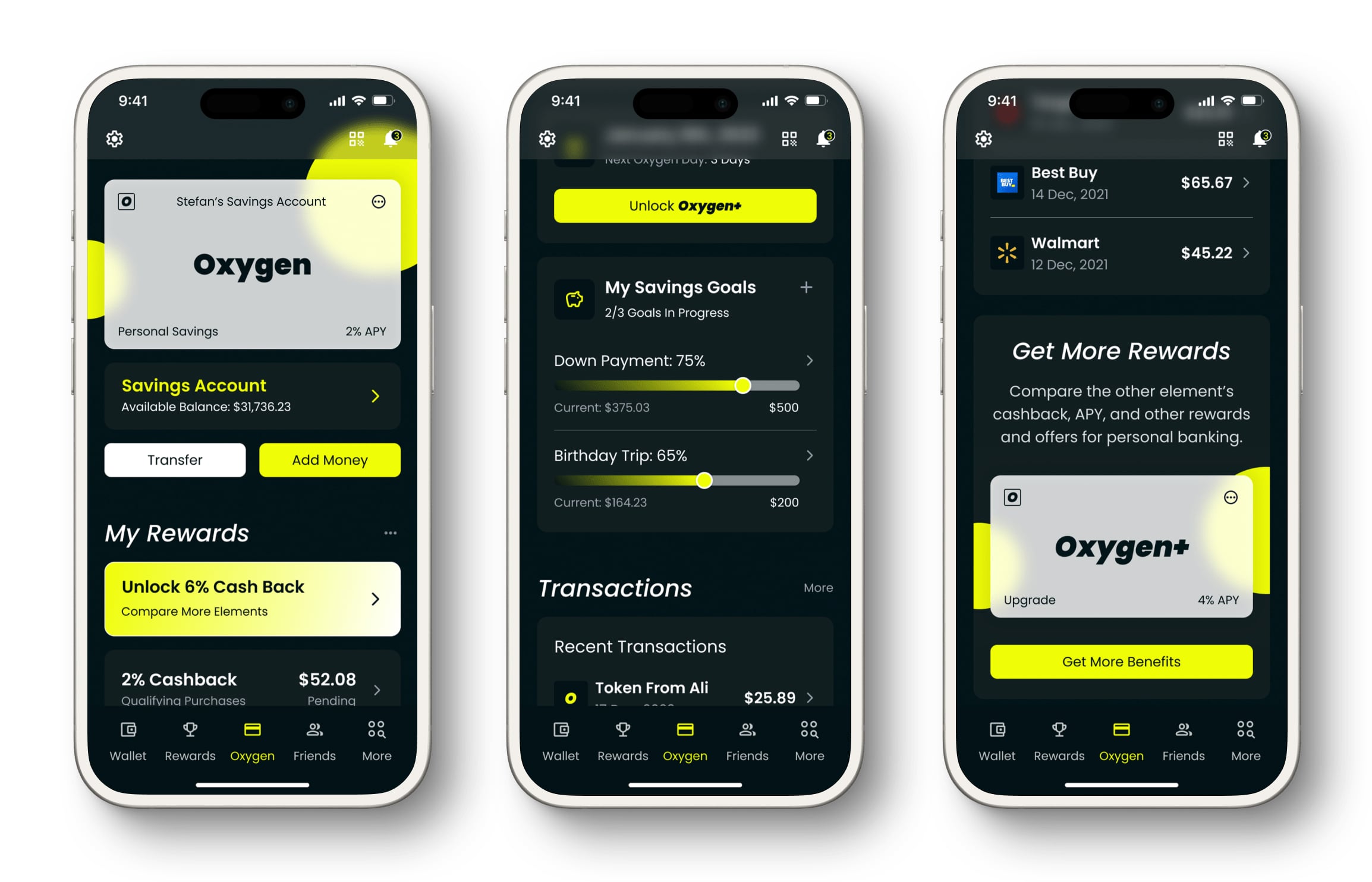
Final Design
The final version utilizes both a light and a dark theme. When compared to the original design this final version has improved contrast, hierarchy, font choice, and accessibility throughout the design. Each section has an updated layout from the original design and is consistent throughout the design.
Icons: Consistent size, weight, and style, and there are fewer icons in the navigation
Text: Text is legible, adheres to standard sizing, and establishes an effective hierarchy
Colors: Light and Dark Mode
-min%20(1).jpg)
Outcome
This project successfully delivered a robust and flexible solution that significantly improved the app's user experience. The client was provided with a series of high-fidelity, polished, and accessible design options that directly addressed their key business goals. My work established a clear, user-centric foundation for the app, creating a more intuitive and visually cohesive product ready for development. The final designs provided a clear path to a more modern and engaging experience that better aligned with the company's brand and business objectives.

Visit Blacksmith Branding